7.1 Beta/Final Prototype
1. The name of my artifact: Cleaver Magazine Reviews
2. Images of my prototype:
(Click any thumbnail to for larger image). If the four images don’t appear, refresh page and they should pop up.
3. Some background on the gap I addressed and my problem definition:
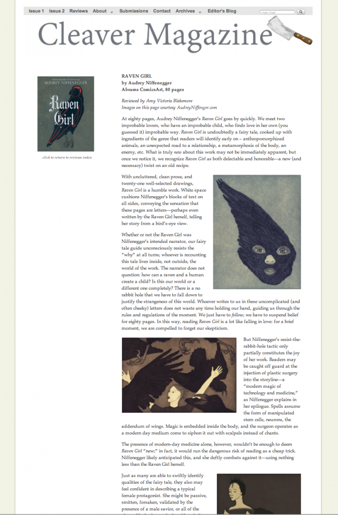
My design gap was: find a way to incorporate occasional reviews of small-press poetry and fiction publications in my quarterly literary magazine. My primary user needs were that the review content be easy to identify (as separate from other content) and access from the front page of the magazine, and be accessible through a menu tab leading to an index page. Additionally, the review content needed to be attractive to the eye. The review authors needed to be instantly identifiable as separate from the authors of the books being reviewed and the authors of the site’s literary content. The review pages need to retain sitewide branding while being immediately distinguishable from other types of content on the site.
I took the review page design through many iterations, first testing the design with mock pages (Check out my fake book reviews, written by squirrels and chickadees), and later experimenting with real content. I also did user tests (I got a lot of great feedback by contacting users through a Facebook post.
I eventually settled on this design (Click through to see the page live):
4. A very short description of what the next steps would be to further refine and develop your artifact:
I’m fairly pleased with the results for the moment, but there a few details that concern me:
- The design and architecture of the site is such that “posts” (i.e., the pages with content, such as book reviews and literary content) have no sidebars. I designed it this way deliberately to allow a clean look, so the reader can concentrate on the article. But in the future I will probably need to incorporate ads throughout the site, so sidebars may become necessary.
- Because there are no sidebars, I need to manually add a caption to the featured image (of the book) with the text “click to return to index”. I’d prefer a somewhat slicker interface.
5. Any other information you feel might be interesting to classmates:
I enjoyed this course so much that I kept a “course blog” with thoughts as the semester progressed.


