5.1 Concept Testing
My design gap: a way to incorporate occasional reviews of small-press poetry and fiction publications in my quarterly literary magazine.
The concepts I am pursuing: Based on last week’s matrix assignment, I’ve narrowed it down to two approaches. This week I sought user feedback on which design is more appealing, engaging, and easy to use.
A description of my process: I approached my readers through my personal Facebook and our Facebook fan page. I invited them to choose an approach, and to give additional verbal feedback, if they wanted to (many did.)
THE CHOICES:
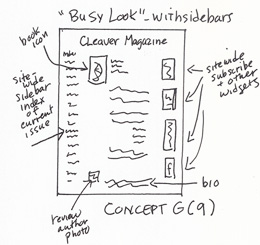
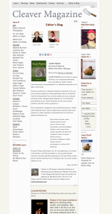
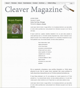
A. “Busy Look”: In this version, the reviews run in narrow columns between sidewide sidebars. This is an “expensive” concept because, due to css styling settings, I have to set up the blogs differently than other posts. It has a very “webby” feel, but is it worth the extra time and effort?
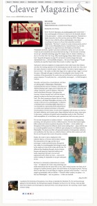
B. “Clean Look”: In this version, the reviews are isolated on the page.
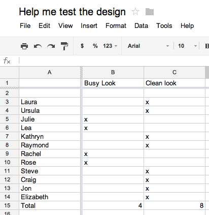
The Results (I put them in a Google spreadsheet):
Conclusion: Two-to-one, the respondents favored the “Clean Look” (B) over the “Busy Look” (A).
In addition to voting, I received these comments:
“D. I am assuming that this is for an on-line publication (that’s how I see Cleaver. Sidebars are very annoying to read on a scrolling screen. I don’t really like multiple columns because I have to scroll up again to continue. I also do not like print that is very wide (like the bottom of D though I do not mind the photos in the columns. I read a line at a time and do not like any printing so wide that I have to do it in more than one scan per line.”
“D (on my computer.) But I wonder if that would work as well on my phone. . .”
“What are you wanting to achieve with this page layout? D is the most handsome, but the least webby–it is much more like the printed page. It looks especially good with the littering of images like in your sample.But in many ways it is a throw-back, not providing the fluidity that good web pages do in a complex site, like a magazine site. This tosses me back to A. If you wanted a quiet place on the site with minimal navigation, or if you were trying to separate this portion of the site out from the rest for some functional reason, then a solution like D works.”
“D. The lines are really appealing.”
“D. The clutter in A gives me a headache!”
“A… i like the busy, webby.”
“Less is more. In other words, D.”
Help me pick a design!
Click on any of the thumbnails for a full-size image! Concept and Prototype A: “Busy” look with full site-wide sidebars. Book icon is in upper left and author’s photo/bio are at bottom. … Continue reading
Thoughts Mid-Week 5
According to the course notes, this was to be a short week because of the Memorial Day holiday. And I guess that’s good because– how is it already Thursday?
I stayed up last night to do the student evaluations. The rubrics are getting harder to juggle, and the scale, well at least last week, was wider. In general, I was very impressed by the projects I evaluated.
One designer simply did not complete the assignment– he only uploaded the images that were carried over from the previous week. There was a note asking for the evaluator to give him until Wednesday, but since it was after midnight I felt I could only give him partial credit set-up of the assignment.
Another did what we used to call a snow job. A ridiculously generic set of user needs and a matrix that could serve as a cartoon example. But really: what is the point of trying to bluff your way through a noncredit course?
For the most part, however, the projects I saw demonstrated skill, thought, innovation, and an investment in time. I’m not sure I would actually want any of their products. The silliest was some kind of chairlike structure to fit inside a hammock so you can work on a laptop. Seems like there would not be much of a market for that one. But, even so, this designer and others did a great job creating thoughtful matrices and impressively crafted prototypes.
I have to remind myself that even though I am now working on a project to do with a website, which is something I already know how to do, I am still learning a lot about the process of development of ideas and products, and how ideas are brought into society. I really wish I had the tools and experience to go forward with a squirrel-proof-birdfeeder, but if I’d kept on in that direction I would have been stuck.
