Thoughts at the End of Week 4
1. Did anyone else think that the testing of the ice cream scoop prototypes was flawed because the ice cream became increasingly soft as the demo wore on? Thus, naturally, the later prototypes worked better. And when he retested the early ones, they suddenly worked better, too.
2. After the taping, did the staff get to eat the ice cream?
3. Will those class members not from the Philadelphia area think that Turkey Hill is an odd name for an ice cream brand?
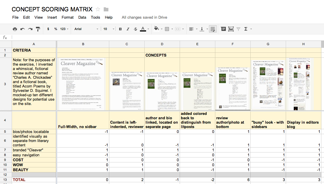
In related news, I really enjoyed doing the Concept Selection Matrix. It confirmed my earlier conclusion of which design was best. The biggest light bulb for me was that this kind of record keeping is a good tool for convincing committees at a glance. The matrix expresses visually what would take a thousand words to communicate.
Assignment #4.2 Prototyping
X: PROTOTYPING
My design gap: a way to incorporate occasional reviews of small-press poetry and fiction publications in my quarterly literary magazine.
List of 6-12 Primary User Needs:
- The review content will be easy to identify from the front page of the magazine.
- The review content will be easy to access from the front page and other menu pages of the magazine.
- The review content is accessible through an index tab on the magazine.
- The reviews are attractive and easy to read.
- The review authors are identified by easy-to-locate bios/photos.
- The review authors are easy to locate through an index.
- The review authors are clearly identified as separate from the literary authors on the site.)
- The review content has a different look/feel to easily distinguish it from the literary content on the site, while retaining the basic brand of the site. (!)
- The review content is easy to navigate to and from, in any part of the magazine.
- The reviews are fun or have some kind of whimsical element, incorporating graphics and/or text (!)
Concept Sketches and Prototypes:
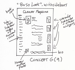
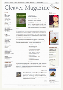
Concept and Prototype G (9): “Busy” look with full site-wide sidebars. Book icon is in upper left and author’s photo/bio are at bottom.
————–
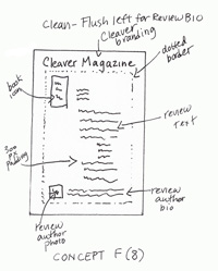
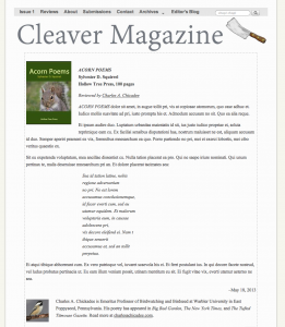
Concept and Prototype F (8): Full width text (to distinguish from literary site content, which is presented with 300 px padding). Book icon at top; reviewer bio and photo at bottom. Dotted border.
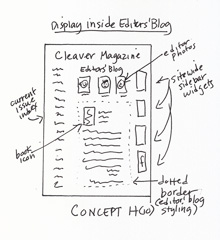
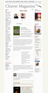
Concept and Prototype G (10): Displaying reviews inline with the existing Editors’ Blog.
Assignment #4.1 Concept Selection
My design gap: a way to incorporate occasional reviews of small-press poetry and fiction publications in my quarterly literary magazine.
List of 6-12 Primary User Needs:
- The review content will be easy to identify from the front page of the magazine.
- The review content will be easy to access from the front page and other menu pages of the magazine.
- The review content is accessible through an index tab on the magazine.
- The reviews are attractive and easy to read.
- The review authors are identified by easy-to-locate bios/photos.
- The review authors are easy to locate through an index.
- The review authors are clearly identified as separate from the literary authors on the site.)
- The review content has a different look/feel to easily distinguish it from the literary content on the site, while retaining the basic brand of the site. (!)
- The review content is easy to navigate to and from, in any part of the magazine.
- The reviews are fun or have some kind of whimsical element, incorporating graphics and/or text (!)
Selection Matrix:
(click on image for larger size)
I loved using this tool. The result, that Concept F is the best design, confirms my intuitive assumption after working through the visual designs last week. I was a little surprised at how pronounced the results were– I thought they would be closer. At first glance it appears that, for my prototypes, I should focus on the F, G, and H. However, G and H are significantly more costly, in terms of labor. So perhaps I should add C to the mix.
Thoughts on Week 4
It’s Wednesday and I’ve not had time yet to view the videos for this week. If I have to stay up until 2 AM again, I will view them today. I think I overshot my homework last week– it seems … Continue reading
