Thoughts on completing Week 2, entering Week 3
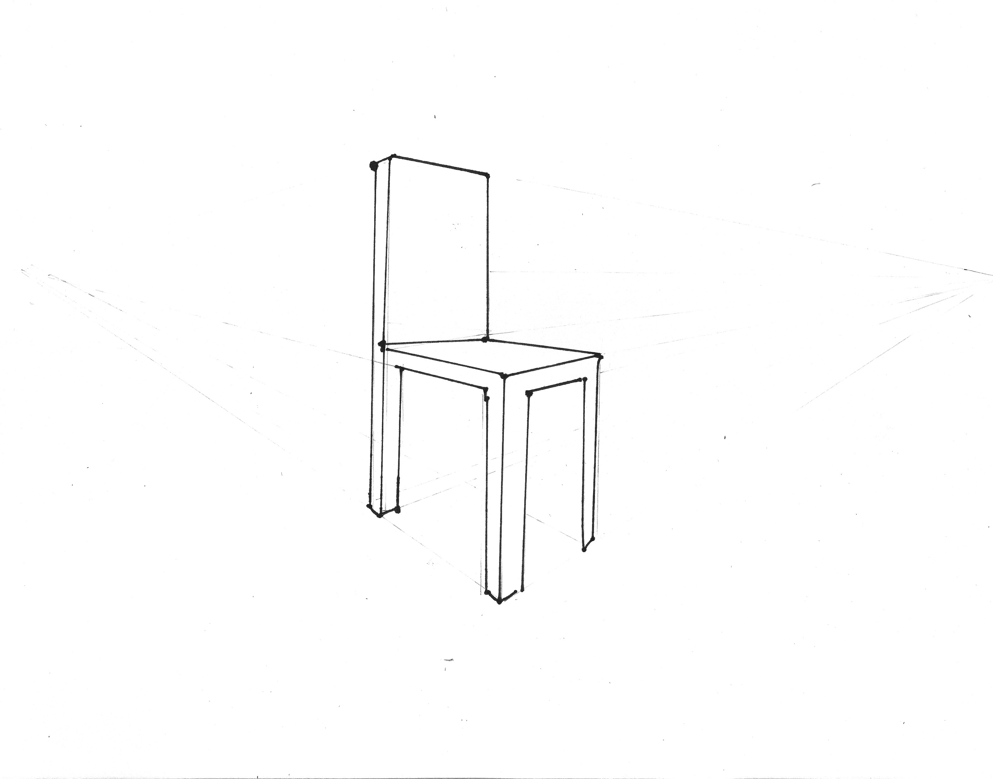
- My grades for Week 1 (peer evaluations) seemed to pretty accurately reflect the work I did. I got full points for everything except the photo of the prototype, which was flawed because I didn’t have a wide-angle lens, so there was no way to see the whole prototype. My awkward chair drawing received full credit with the notation: “Simple, but filled the requirements.” Perhaps “simple” was too kind.
- I just finished watching the videos for Week 3. It’s quite a lot to watch, but again, I found the material to be interesting and not too challenging. The possible exception was the 28-minute lecture by the TA on drawing in 2-point perspective. Although I understood everything as it went by, I also realized that it would take me many hours of practice to really master this skill. I did learn to draw like this as a child, but it’s been years. I have a sense that these drawing skills should be a pre-requisite for this course: an earlier course in technical drawing. As someone who is not trained in technical drawing, I feel as if I am at a serious disadvantage. For example, this week’s lectures in “Decomposition” by Professor Ulrich feature him creating charming thumbnail sketches of each example. It is impossible for me, at my skill level, to create sketches like these. If I were to take a preliminary course in technical drawing, then I would have a realistic chance of putting my ideas to paper.
- At this point, I don’t have 40 hours to devote to Week 3’s assignments. My choices seem to be either to a) pick a different project, something that is more conceptual and 2-dimensional (such as the Renga Website project); b) muddle through with bad drawings; c) give up on the homework and just watch the lectures. But I know if I choose c) I will stop feeling engaged with the projects. If I choose b) I will be come discouraged. Is a) the right choice? Should I switch projects?
- If I switch projects, does this mean I have to redo last week’s homework? I don’t have time to do that, either.
Towards the End of Week 3
I’m a little discouraged. Throughout the week I’ve tried to imagine how to approach the assignment of exploring ten concepts of user needs in graphic drawings. While I can imagine these things, I really can’t draw them– I just don’t have the facility. Even the 2-point perspective chair assignment seems daunting. I think I would need a whole week on the chair alone, or more, to do a really good job.
I meditated about this problem while driving up to New York to bring my daughter back from college. Then it occurred to me that, in other areas of my life, I do go through the same steps and iterations described by Professor Ulrich– I just don’t create graphical representations.
This week I had a project to incorporate book reviews into the literary magazine I edit. I had some review content, and the problem was how to best place it into the magazine so that readers would be able to find it, and so that authors (of both the reviews and the books being reviewed) would be able to link to it. Without going into detail, I could easily come up with a list of 20-30 user needs. I spent the better part of the day creating different designs and iterations before coming up with the version I decided to use. Although I did not make sketches, I did everything else in Professor Ulrich’s process. So my questions are
- Is the takeaway that I should be making sketches while I work through problems, as a way of keeping a physical document? I have tried making sketches and notes, but they slow me down– I get very bogged down as I try out one concept, than another, and I lose my forward thoughts while recording present thoughts.
- Is there any point in recording a process that I am already doing? I don’t just want to throw in something from my present life, just for the sake of continuing the course.
Assignment #3.2
VISUAL EXPRESSION III: 2 POINT PERSPECTIVE
Sketch a chair correctly in 2 point perspective (three quarter view) and submit according to the sketching and scanning guidelines.
I know this chair pales in comparison to most of my classmates’ chairs…but it was still very hard to draw and I’ve got many paper snowballs in my recycling bin as a result. –KR
Assignment #3.1
EXPLORATION (10 CONCEPTS)
My design gap: a way to incorporate occasional reviews of small-press poetry and fiction publications in my quarterly literary magazine.
Primary User Needs:
- The review content will be easy to identify from the front page of the magazine.
- The review content will be easy to access from the front page and other menu pages of the magazine.
- The review content is accessible through an index tab on the magazine.
- The reviews are attractive and easy to read.
- The review authors are identified by easy-to-locate bios/photos.
- The review authors are easy to locate through an index.
- The review authors are clearly identified as separate from the literary authors on the site.)
- The review content has a different look/feel to easily distinguish it from the literary content on the site, while retaining the basic brand of the site.
- The review content is easy to navigate to and from, in any part of the magazine.
DECOMPOSITION
For this exercise I chose two user needs and approached each as a sub-problem, coming up with a list of potential solutions. Click on the links for a visual demonstration.
A. The review content has a different look/feel from the literary content on the site, while retaining the basic brand of the site.
- colored background (contrast with white background in literary posts.)
- different font (contrast with serif font in literary posts)
- borders (contrast with no border on literary fonts. See styling in Editors’ Blog.)
- padding/no padding (contrast 300 pixel padding style in literary posts with full-width style in Editors’ Blog.)
- use a different site or custom css as a workaround for suppressed post headings (due to overall site rules) Explanation: to preserve the “magazine look” I have suppressed the usual post meta-data. But the blog-like entries look better with meta-data. So I manually re-created this, in the Editor’s Blog.)
- make reviews part of Editor’s blog? Instead of their own category?
- use sidebars/no sidebars? (Sidebars=busy appearance, easier to navigate site; no sidebars=easier to focus on text)
- featured images (book covers?)
- featured images (book authors vs. review authors)
B. The review authors are identified by easy-to-locate bios/photos.
- separate bio/photo page for all reviewers (example)
- bio/photo at the bottom of the page
- author photo as featured image, bio at bottom
- author photo as feature image, link to bio on separate bio page
- author photo as featured image, link to personal site of reviewer
- bio/photo on separate review contents page
- no reviewer’s photo, bio at bottom
- no reviewer’s photo or bio, link to outside personal page only
10 DESIGN CONCEPTS
Note: for the purposes of the exercise, I invented a whimsical, fictional review author named “Charles A. Chickadee” and a fictional book, titled Acorn Poems by Sylvester D. Squirrel. I mocked-up ten different designs for potential use on the site.
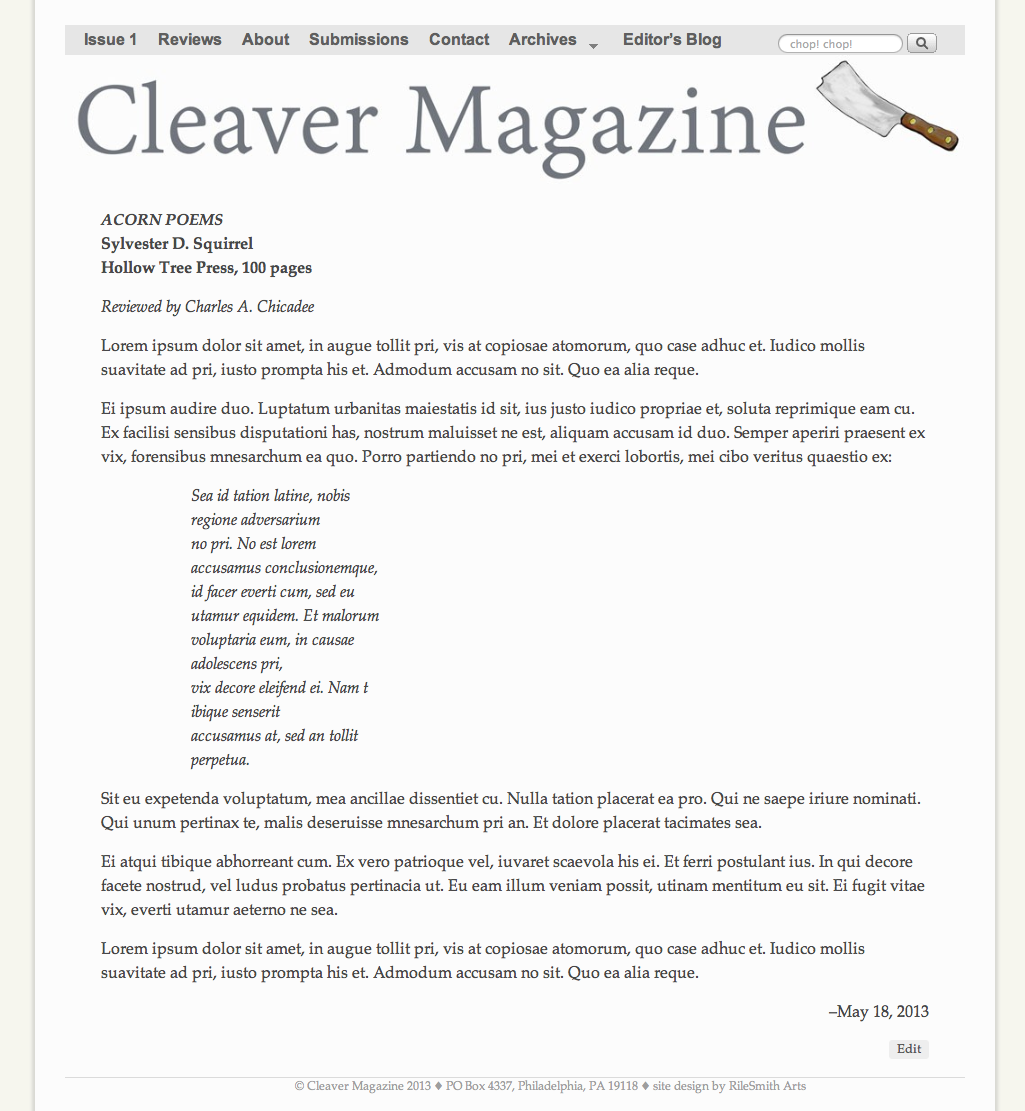
Concept #1: Full-width (no sidebars), no reviewer photo or bio, no featured image. This is the plainest, simplest cleanest look. (Click thumbnail for full-size image.)
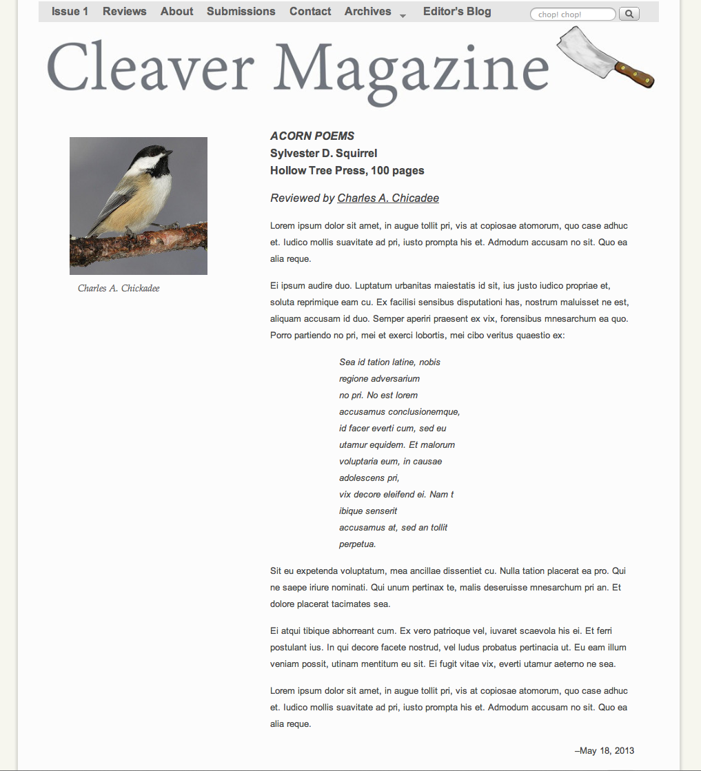
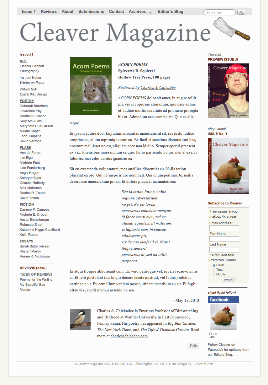
Concept #2: 300 px padding for review content; review author’s photo aligned left. Link to bio of reviewer; no image or artwork of the book. This is also a clean look and is aligned with the design of the original literary posts on the site. I think it looks too similar to the literary posts and is difficult to differentiate at a glance. (Click thumbnail for full-size image.)
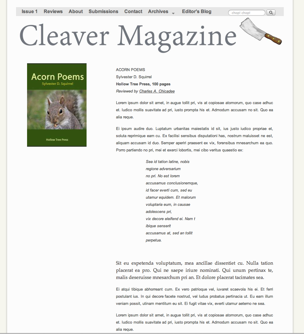
Concept #3: 300 px padding for review content; link to author photo and bio on a different page (example); artwork for book cover is aligned left. This look separates the literary post style from the review post style, but I think that different alignments are visually awkward, as is the shape of the book art cover (author’s photos on the site are cropped square. (Click thumbnail for full-size image.)
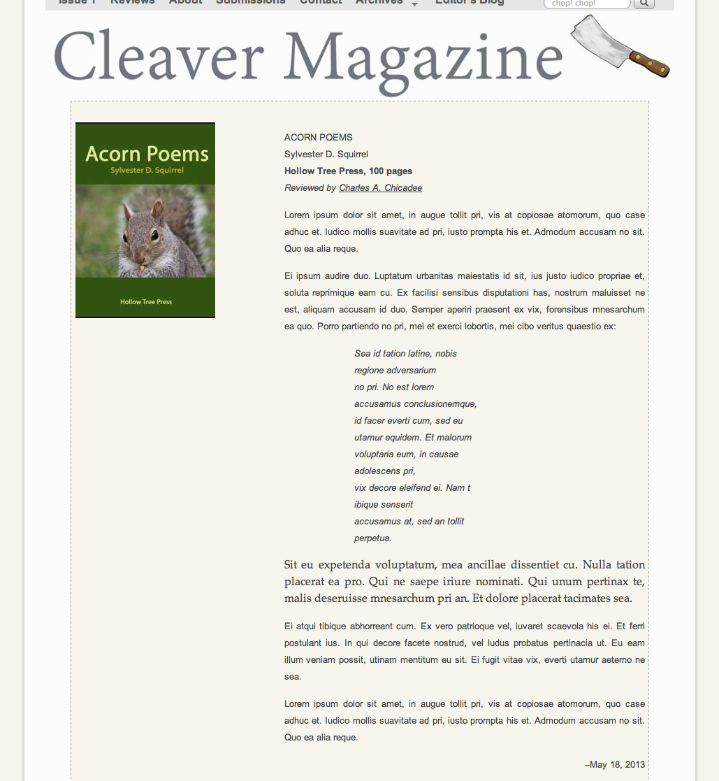
Concept #4: 300 px padding for review content, etc., as in #3. Added colored background and dotted border, to distinguish from literary post contents. I think it’s ugly. (Click thumbnail for full-size image.)
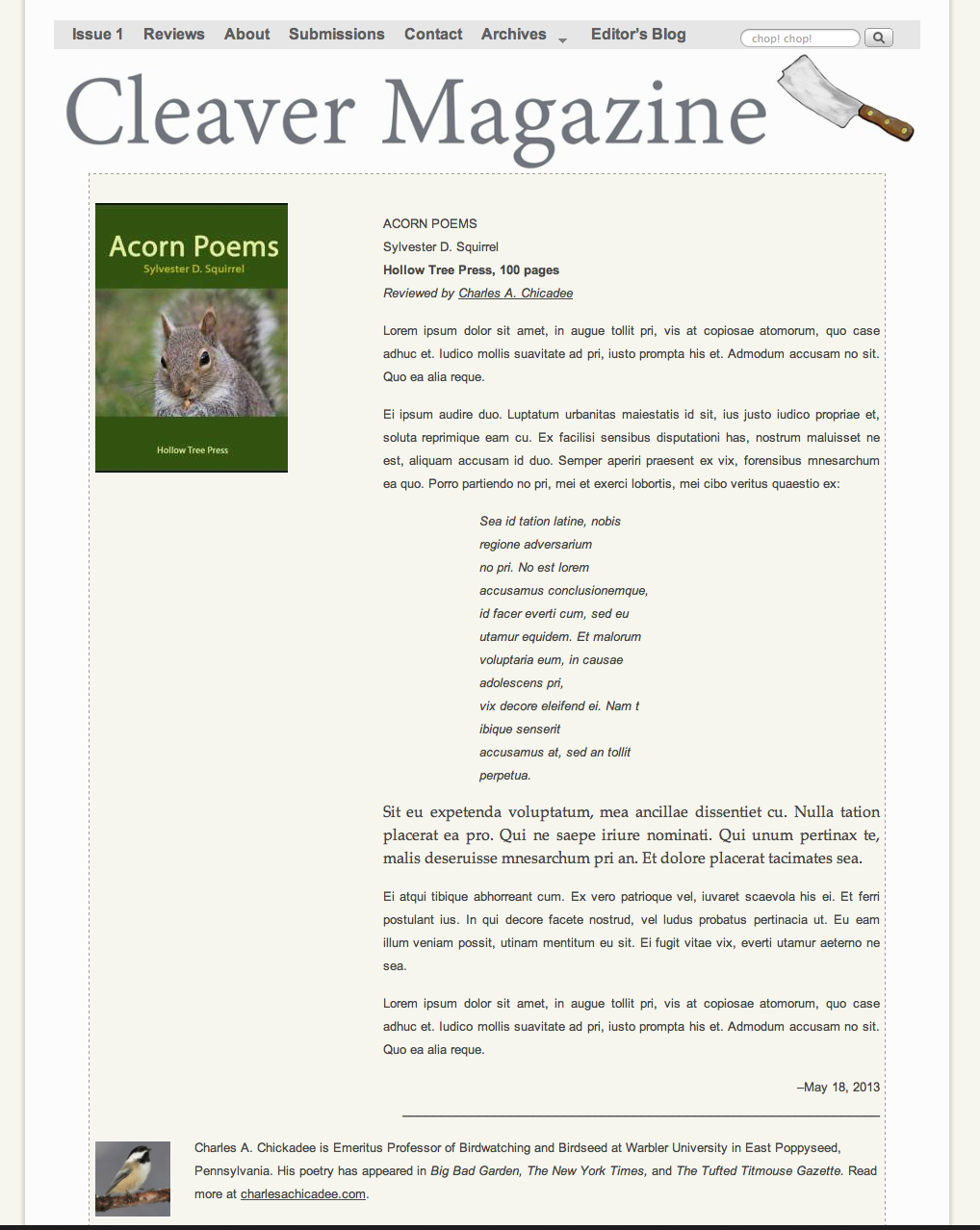
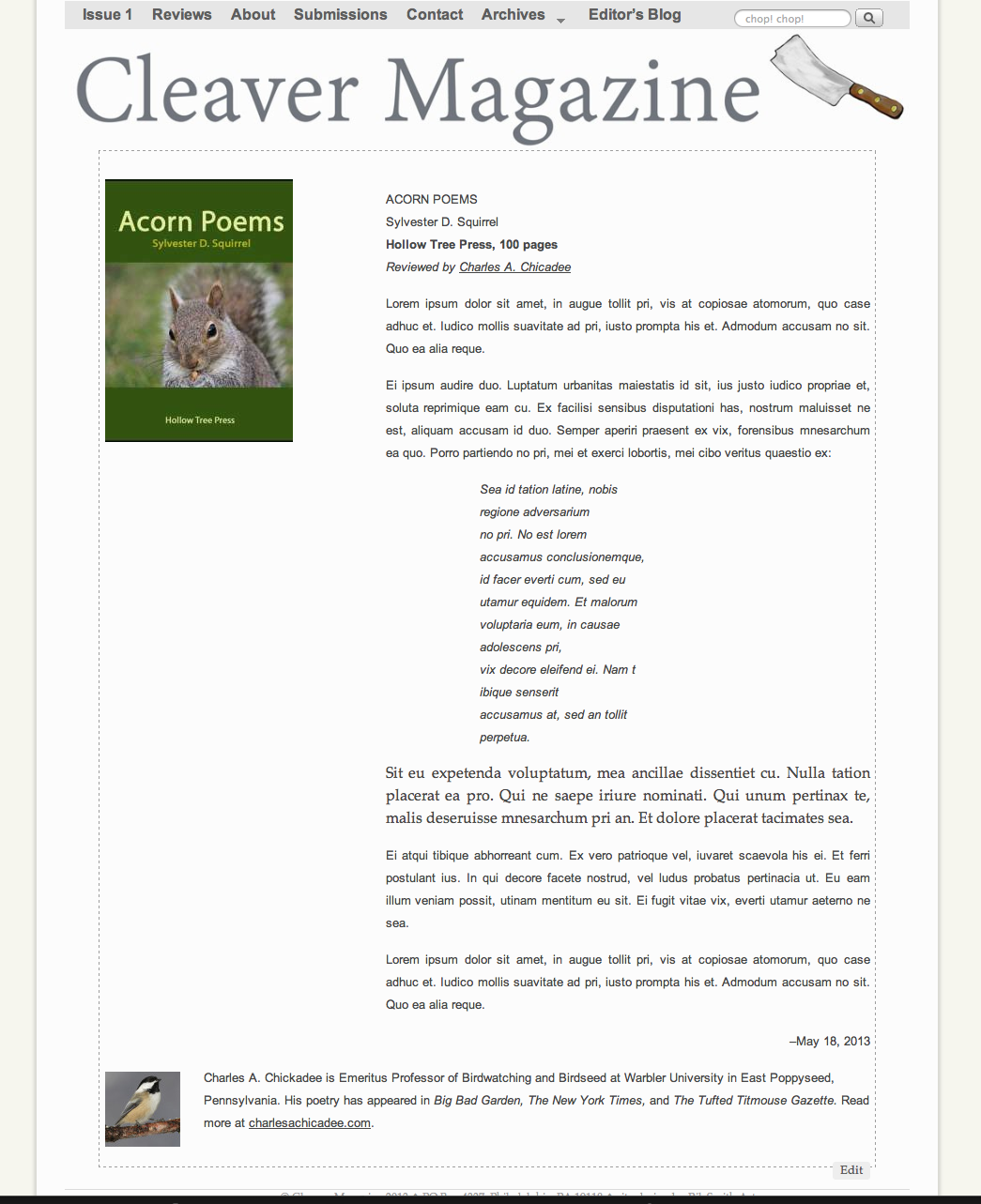
Concept #5: 300 px padding for content, colored background and dotted border, added author’s photo and bio at bottom, instead of in separate link. (Click thumbnail for full-size image.)
Concept #6: Same as above, but no color in the background. (Click thumbnail for full-size image.)
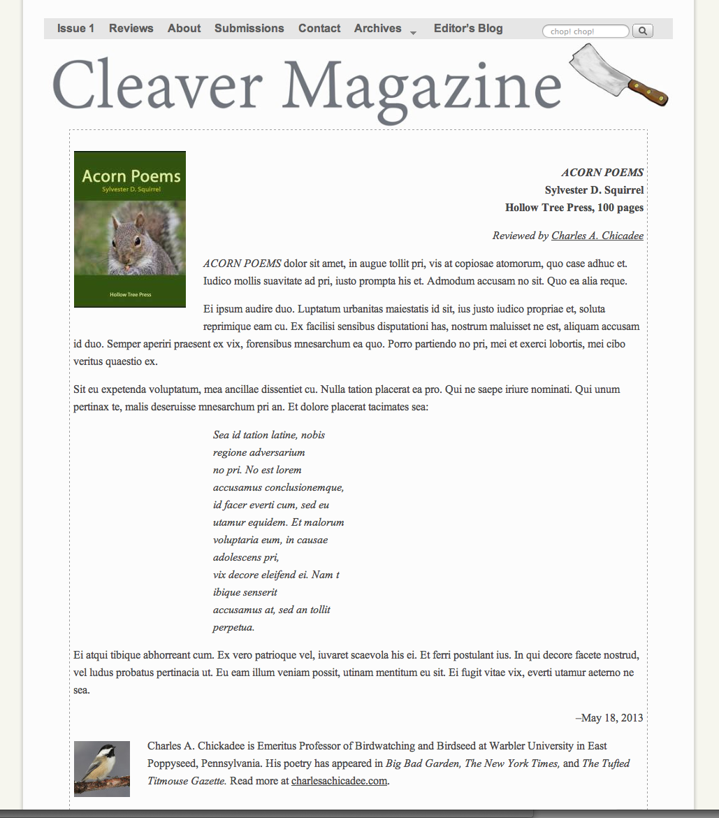
Concept #7: Full-width, Book info is flush right. (Click thumbnail for full-size image.)
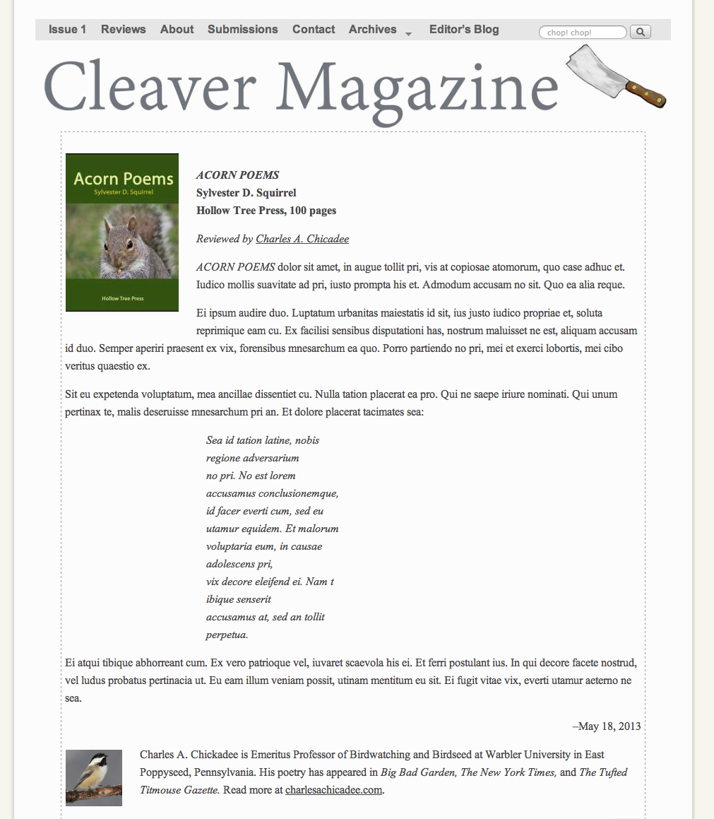
Concept #8: Same as above, info flush left. (Click thumbnail for full-size image.)
Concept #9: With sidebars (for a “busier” look) and easy access to other menus. (Click thumbnail for full-size image.) (Click thumbnail for full-size image.)
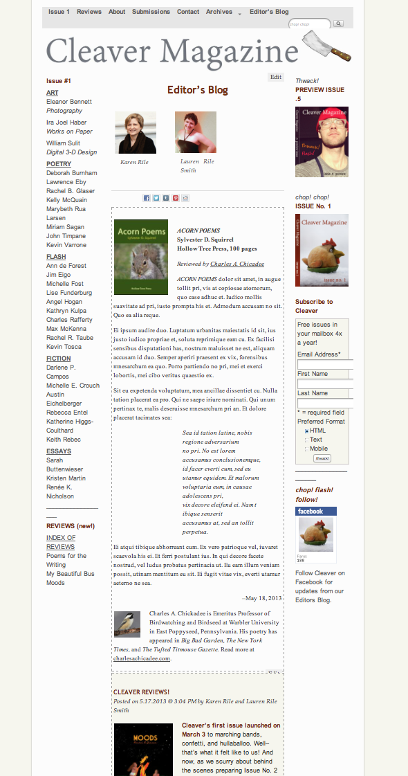
Concept #10: Display as part of Editors’ Blog:
