Thoughts on Finishing the Class
I signed up for this class because I wanted to take something that was outside my “comfort zone.” But it turns out that a course in industrial design (I thought it was just general design) was too far outside of that zone– I am not really a “materials” person. I don’t have a woodshop; I don’t sew or build things. I do ceramics, but for me ceramics is about art, not design. Plus, I’m not good enough to create genuinely new kinds of functional objects.
Mostly I work with words and ideas, and as the daughter and sister of graphic designers, I do like to work with images and text on a a page or screen.
I began this class identifying a “gap” that I thought to be both whimsical and real: a birdfeeder that cannot be destroyed or subverted by squirrels. But I had no idea how to create even a rough prototype. Sure, my husband does stuff like this all the time. Our house is full of Rube Goldberg contraptions. But this is a project I wanted to take on myself. So I switched my project to something I happened to be working on concurrently: a design for incorporating book reviews into a magazine website. No longer out of my comfort zone– but at least now I could do the assignments.
What I found most useful about the class was that it gave me a structure for thinking about ideas that I already understood intuitively. I did all of the matrices and other exercises, and the end result was always the same as what I would have done anyway, without going through the process. But I found it useful to have the tools to validate my own choices and ideas. As Professor Ulrich pointed out in one of his lectures, it’s often useful to be able to supply this supportive material to a committee.
I took pages of notes on every lecture (and screenshots of the illustrations.) I don’t know if I will refer to them in the future, but I think I’ll put them up on this site for reference if I can figure out how to translate the files from the Apple Notes application I used.
One other thing– although these assignments were graded by peer review, not instructors, I was surprised by how invested I got in the feedback. My scores (I think) are near perfect (early on, I was rightfully docked a point for a sub-par birdfeeder photo.)
Here is the review I posted of the class on courseratalk.org.
Help me pick a design!
Click on any of the thumbnails for a full-size image!
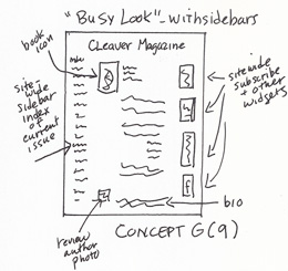
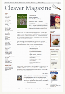
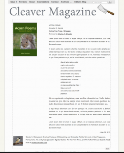
Concept and Prototype A: “Busy” look with full site-wide sidebars. Book icon is in upper left and author’s photo/bio are at bottom.
————–
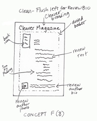
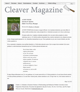
Concept and Prototype B: Full width text (to distinguish from literary site content, which is presented with 300 px padding). Book icon at top; reviewer bio and photo at bottom. Dotted border.
————–
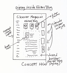
Concept and Prototype C: Displaying reviews inline with the existing Editors’ Blog.
————–
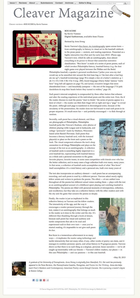
Concept D: The text of the review has 300 px padding to the right. To the right is an example that is also live on the site.
Thoughts Mid-Week 5
According to the course notes, this was to be a short week because of the Memorial Day holiday. And I guess that’s good because– how is it already Thursday?
I stayed up last night to do the student evaluations. The rubrics are getting harder to juggle, and the scale, well at least last week, was wider. In general, I was very impressed by the projects I evaluated.
One designer simply did not complete the assignment– he only uploaded the images that were carried over from the previous week. There was a note asking for the evaluator to give him until Wednesday, but since it was after midnight I felt I could only give him partial credit set-up of the assignment.
Another did what we used to call a snow job. A ridiculously generic set of user needs and a matrix that could serve as a cartoon example. But really: what is the point of trying to bluff your way through a noncredit course?
For the most part, however, the projects I saw demonstrated skill, thought, innovation, and an investment in time. I’m not sure I would actually want any of their products. The silliest was some kind of chairlike structure to fit inside a hammock so you can work on a laptop. Seems like there would not be much of a market for that one. But, even so, this designer and others did a great job creating thoughtful matrices and impressively crafted prototypes.
I have to remind myself that even though I am now working on a project to do with a website, which is something I already know how to do, I am still learning a lot about the process of development of ideas and products, and how ideas are brought into society. I really wish I had the tools and experience to go forward with a squirrel-proof-birdfeeder, but if I’d kept on in that direction I would have been stuck.
Thoughts at the End of Week 4
1. Did anyone else think that the testing of the ice cream scoop prototypes was flawed because the ice cream became increasingly soft as the demo wore on? Thus, naturally, the later prototypes worked better. And when he retested the early ones, they suddenly worked better, too.
2. After the taping, did the staff get to eat the ice cream?
3. Will those class members not from the Philadelphia area think that Turkey Hill is an odd name for an ice cream brand?
In related news, I really enjoyed doing the Concept Selection Matrix. It confirmed my earlier conclusion of which design was best. The biggest light bulb for me was that this kind of record keeping is a good tool for convincing committees at a glance. The matrix expresses visually what would take a thousand words to communicate.
Towards the End of Week 3
I’m a little discouraged. Throughout the week I’ve tried to imagine how to approach the assignment of exploring ten concepts of user needs in graphic drawings. While I can imagine these things, I really can’t draw them– I just don’t have the facility. Even the 2-point perspective chair assignment seems daunting. I think I would need a whole week on the chair alone, or more, to do a really good job.
I meditated about this problem while driving up to New York to bring my daughter back from college. Then it occurred to me that, in other areas of my life, I do go through the same steps and iterations described by Professor Ulrich– I just don’t create graphical representations.
This week I had a project to incorporate book reviews into the literary magazine I edit. I had some review content, and the problem was how to best place it into the magazine so that readers would be able to find it, and so that authors (of both the reviews and the books being reviewed) would be able to link to it. Without going into detail, I could easily come up with a list of 20-30 user needs. I spent the better part of the day creating different designs and iterations before coming up with the version I decided to use. Although I did not make sketches, I did everything else in Professor Ulrich’s process. So my questions are
- Is the takeaway that I should be making sketches while I work through problems, as a way of keeping a physical document? I have tried making sketches and notes, but they slow me down– I get very bogged down as I try out one concept, than another, and I lose my forward thoughts while recording present thoughts.
- Is there any point in recording a process that I am already doing? I don’t just want to throw in something from my present life, just for the sake of continuing the course.
Thoughts on completing Week 2, entering Week 3
- My grades for Week 1 (peer evaluations) seemed to pretty accurately reflect the work I did. I got full points for everything except the photo of the prototype, which was flawed because I didn’t have a wide-angle lens, so there was no way to see the whole prototype. My awkward chair drawing received full credit with the notation: “Simple, but filled the requirements.” Perhaps “simple” was too kind.
- I just finished watching the videos for Week 3. It’s quite a lot to watch, but again, I found the material to be interesting and not too challenging. The possible exception was the 28-minute lecture by the TA on drawing in 2-point perspective. Although I understood everything as it went by, I also realized that it would take me many hours of practice to really master this skill. I did learn to draw like this as a child, but it’s been years. I have a sense that these drawing skills should be a pre-requisite for this course: an earlier course in technical drawing. As someone who is not trained in technical drawing, I feel as if I am at a serious disadvantage. For example, this week’s lectures in “Decomposition” by Professor Ulrich feature him creating charming thumbnail sketches of each example. It is impossible for me, at my skill level, to create sketches like these. If I were to take a preliminary course in technical drawing, then I would have a realistic chance of putting my ideas to paper.
- At this point, I don’t have 40 hours to devote to Week 3’s assignments. My choices seem to be either to a) pick a different project, something that is more conceptual and 2-dimensional (such as the Renga Website project); b) muddle through with bad drawings; c) give up on the homework and just watch the lectures. But I know if I choose c) I will stop feeling engaged with the projects. If I choose b) I will be come discouraged. Is a) the right choice? Should I switch projects?
- If I switch projects, does this mean I have to redo last week’s homework? I don’t have time to do that, either.
Thoughts on completing Week 1, entering Week 2
- Perhaps I should have chosen a Coursera course that is more in line with my own skill level. Although I am very interested in the content of the course, I am not skilled enough at drawing, and I have no ability to make 3-D models, nor do I have the right equipment.
- On the other hand, one of my goals was to do a course that would put me out of my comfort zone and would call on me to use methods other than reading and writing text, or dealing in 2-D design.
- From perusing the forums, I am very impressed by the earnest cheerful collegiality of my fellow students, many of whom are quite accomplished drafts-persons (is that a word?) Many enrolled in the class seem to be trained as architects and product designers, so I feel a little intimidated when I view their work. I have not detected any sense of arrogance or competition, just mutual support.
- 30K+ is a heck of a big class. I wish I could have a smaller peer group so that I could follow the work of a selected subset. The size of the class feels overwhelming.
- For me, as a neophyte, the lectures seem to be pitched at just about the right level of difficulty. They are engaging, but I never find myself lost. On a very few occasions during the Week 1 and Week 2 videos I have fast-forwarded because I understood the point that was being elaborated. On about the same number of occasions, I’ve had to rewind to listen to a point again. I am taking notes on my computer (typing them) as I listen (because that is how I best learn, through writing words) but I have not had to actually refer back to my notes while doing the assignments.
- I enjoyed doing the Week 1 evaluations, but I am used to evaluating student work in my role as a teacher. I notice from some comments on the forums that other students find evaluations difficult.
