- Artifact, not just physical in nature. Can be software, etc.
- salad caprise
- fine arts library at Penn
- staircase in apple store
- ice cream scoop (10th century ice cream scoop) (?)
- design is responsive to problems- crude block of wood with iron tray
- Design is “conceiving and giving form to artifacts that solve problems”
- first effort is not always great
- how do we go from first effort to refined product?
- What is included in human activity of design?
- but a label for a product using inversion could be an example of design
- videos
- e-book; more depth, sources
- work:
- projects; weekly assignments related to project
- periodic other assignments
- visual expression
- how to make a thumbnail (10 sec) sketch
- more refined illustrations (10 minutes)
- Evaluation: all by peers
- rubric provided in advance
- Communication- post to discussion forum. Twitter feed.
- Shewhart (?) quality improvement process
- Roots in Scientific Method
- 4 pieces
- sensing a gap
- define the problem
- explore alternatives
- select a plan (THIS IS NOT OBVIOUS?)
- as you explore solutions, you get greater clarity about problem definition
- examples of ice cream scoop iterations
- Identify some problem in your own life to take on as a course project.
- Make it a gap that you personally feel.
- access to at least 5 other people who feel this gap in their life (face to face)
- problem simple enough to address in an 8-week course
- pick a problem that you can address with skills that you have
- Examples from Karl’s life:
- iPad case (wallet, sunglasses, etc.) How can he carry them in a hipper way?
- desk– too much chaos and mess (Hey, this would be a good one for me)
- shirt- wants to reproduce one he likes, short run
- moving to smaller space without room for bikes
- where to get lunch at Penn
- avoid common pitfalls
- fill the frame
- use dark lines
- annotate where appropriate
- make sure scan is high quality
My Gap: a website to facilitate the creation of Renga.
Background: Renga 連歌 is a collaborative, social poetry form dating back to medieval Japan, originally practiced at gatherings of court poets. Poets work in pairs or groups, composing alternating three line and two line stanzas, following various formal rules. Each subsequent linked stanza references the stanza prior, although there is no sustained narrative thread.
I want to design a way for a closed group of modern renga practitioners to create, archive, and publish their renga chains electronically.
Lecture 2a
Problem Statement “Statement of Design Problem”
- go thru deliberate process to consider problem statement
- neutral terms about the form of the solution. “how do we create a better handheld tool from forming balls of ice cream from a bulk container” makes less assumption than “build a better ice cream scoop”
- The Five “Whys” — a series of why’s takes from a focused product statement to a much more general statement (family togetherness)
- Motive: why would we want to do that?
- To better dispense single servings of ice cream at home? Why?
- to provide convenient access to tasty deserts at home. Why?
- to enjoy meals at him more often. Why?
- To build family togetherness
- Can also go in the other direction, more specific: “The Hows”
- how might we create a better handheld tool?
- improve ergonomics? how?
- better way to transmit axial force from user arm? how?
- A hierarchy from most specific to most general
- Given that any design problem can be stated in ways that are more general or more specific than initially posed, how the does designer pick the right level of generality for the problem statement?
- In what way can we increase hand-washing in health care (example)
- What is the right level of abstraction for a given design problem?
- more general: opens up more possibilities for approaches. (Pre-formed ice cream units)
- too general? level of abstraction cannot make measurable difference
- make Design statement slightly more general than you are comfortable with
- separation between designers and users occurred thousands of years ago
- not every users has the expertise to design every artifact that he or she needs
- he had to rely on experts to help with his house design
- economies of scale
- hand-made scooter deck costs $100 ; dye-cast scooter desk (but the mold costs $50K) (part cost is $20 if you make 10K scooters)
- institutions pool interests, creates single design
- a professional designer needs to understand users (users that are not you.)
- not every users has the expertise to design every artifact that he or she needs
- Problem definition- crafting a statement that captures the top level objective (the 5 whys)
- defining user needs
- rental car story
- understand user needs, they will be satisfied, repeat, even tell friends about positive experience
- 30-400 distinct user needs per product
- User needs are usually verbal, usually in a list
- Not all user will value every need
- some needs will be contradictory
- not all needs equally important
- divide needs into different categories (Kano framework)
- horizontal dimension is the extent to which the need is addressed
- vertical is user satisfaction
- don’t care( bicycle)
- linear (cost/affordability) If it costs $20 I am half as happy as if it costs $10
- must haves (if not addressed, invoke intense dissatisfaction (but you get no credit if successful.) Eg: cart is stable when parked
- latent needs (MOST important) If unaddressed, user won’t notice, but if you do it well you get delight. Eg: cart can serve as portable tabletop
- when you organize needs, sort into clusters, general and subordinate
- There are analytical and empirical methods for arranging needs
- connect with users (who and how many?)
- focus groups are less effective than one-on-one interviews
- interact with users one-on-one
- interview a minimum of ten in each distinct segment
- observational methods- a passive observation of the user in action
- go to location where they are using the products
- look for:
- awkward actions
- homemade solutions to problem
- signs (handwritten)
- visible frustration
- inefficiencies
- errors
- document with photos etc
- interviews
- one-on-one
- user environment
- open-ended discussion with prompts
- observe non-verbal info and document with notes
- Collect raw data
- notes, photos, videos, verbatim comments of users, (audio is difficult because it requires transcription)
- code into need statements
- flat latent needs
- establish relative importance of needs
- Needs statements are as specific as raw data. (not an over-generalization)
- Express needs without implying a design concept (focus on the what and not the how)
- Other conventions:
- express needs as an attribute of the artifact to be designed (use active voice)
- Avoid words “must” and “should” (use simple present tense)
- Arrange Needs Hierarchically
- needs can be clustered by similarity
- One need is usually more general than the others and can serve as the PRIMARY needs
- Flag the latent needs
- “! The cart provides a temporary “table top” when in the outdoors”
- subjective judgement of designer
- often result of non verbal cues from observation
- sometimes provided by “lead user” innovators
- “! The cart provides a temporary “table top” when in the outdoors”
- Concepts are usually sketches. (UH OH)
- Reasons for great design concept
- to address user needs “Kind” bar (benefits responsive to user needs of target customers)
- responsive to challenges of cost
- Glide dental floss (teflon)-useful to customers with tight gaps
- the package is a clever design- “living hinge”– entire package is a single injection molded part with two hinges, folds to form package. Manufacturing cost- fractions of cent. A design concept for a package of product for low manufacturing cost
- the WOW factor– Oxo measuring cup- it has a beveled shelf inside cup angeles at 45 degrees with units of measure, so you can look down from top to read measure
- aesthetics and elegance — xootr logo (begins with concept)
- How to do this? Generate a LOT (dozens or hundreds)of alternatives to find the exceptional concept.
- Concept generation/exploration is really hard and takes more effort that most appreciate
- stick figure for his illustration took hundreds of attempts– this is hard work
- be open to all ideas— dumb luck leads to great concepts
- bicycle seat concept- pivoting concept came from a “dumb accident”
- it’s iterative– you will have additional ideas for new concepts.
- Normal practice is to call a meeting– flip chart, easel, whiteboard
- this is the single worst thing you can do as a leader!
- analogy: you are on a desert landscape looking for gold
- all huddle together and wander around as a group, watching a 4th person dig and do exploration
- all four go off in different directions and come back to repot that you found, then go together to explore more promising areas- this is a better approach
- Group approach vs Hybrid Approach
- group= 4 people work together 30 minutes
- hybrid= 10 minutes alone, 20 minutes exploring as group
- provide a numerical target (e.g.: 10 ideas)
- hard to get people to do homework? then call the meeting but have them work alone for first 30 minutes of allotted time.
- Getting hands dirty is important (clam shucking experiment)
- Basic idea: you have a big design problem
- it’s unwieldy, so divide into sub-problems
- key or latent needs
- sequence of user actions
- by function
- Solve the sub-problem
- considering only the sub-problem in isolation, what are concepts that will respond to it?
- Integrate solutions
- like choosing from a sandwich menu– integrate into an overall solution concept
- one from each column
- it’s unwieldy, so divide into sub-problems
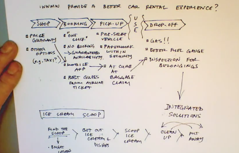
- “In what way might we provide a better car rental experience?”
- sequence of user actions: shopping, booking, pick-up, use, drop-off 1:42 for image
- drop-off: gas! (auto rental companies make money refilling fuel– lot of pain around this
- they don’t use good fuel gages– was it full when you got it?
- Inspection step– so you don’t leave your belongings
- IWWMW (In What Way Might We) Create a better hand-held tool for forming balls of ice cream from a bulk container?
- Create a flow chart
- ice cream -> divide from bulk -> form ball
- Flow of energy
- apply human force/nice portion
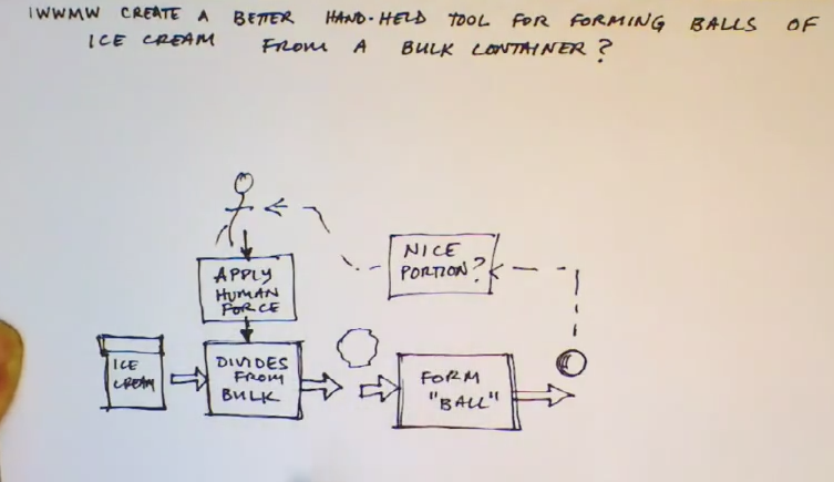
- Next step in using function diagram is to pick 2 or 3 functions to focus exploration.
- focus on application of human power & dividing ice cream from bulk
- “divide from bulk”
- “apply human power”
- the key to decomposition is to focus single-mindedly on subproblem, not within context
- ways to “apply human power”
- twisting, squeezing, hammering or impacting, pushing, pulling, stepping, lopping (shears)
- ways to “apply human power”
- focus on application of human power & dividing ice cream from bulk
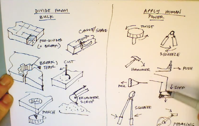
- ways to “divide from bulk”
- Pre-divide (+ break), break, tear, punch, cut, excavator scoop, carve/shave
- annotation is helpful

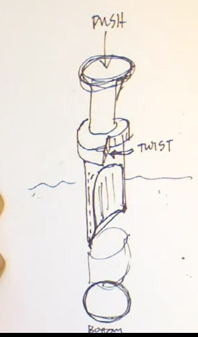
- pick one from each column and create a scoop that illustrates these two principles.
- “punch and twist”- imagine a scoop with cylindrical section like cookie cutter. Press cutter into ice cream. Put thumb on indentation and twist
- Some designers feel that they must be totally original
- But products today evolve from what has been done in the past. It’s silly not to look at what exists.
- For products it’s easy– just go look at what is out there. Go to Amazon and look at product reviews
- In products, there are intellectual property issues/patents (utility patents)
- Do this last and add information to your concepts and ideas
- What is perspective?
- 1 point perspective: road converging in single point (vanishing point). Lines go to single point
- 2 point is looking at corners of building, edge, and 2 sides. Vertical lines are all vertical. You do not see vanishing points in finished drawing
- 3 point, you can see that top and bottom edges recede.
- 2 Point: start focusing on blocks
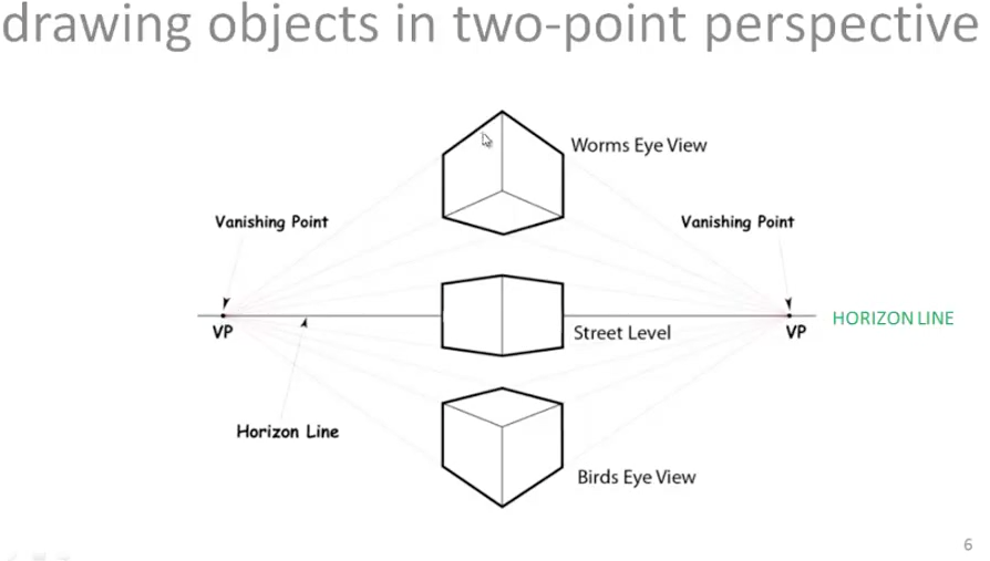
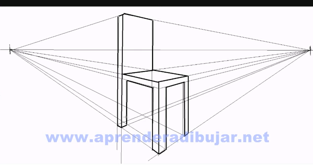
- Left brain vs. right brain– the best designers are equally adept at both.
- so far we have mostly used our right brain in this course.
- now onto left brain.
- First desirable characteristic for any selection method is to get the right answer
- if it’s just for you, pick the solution concept you like best
- for large group, it’s not so intuitive to know what concept will close gap.
- 2nd desirable characteristic is that you can communicate the logic for the decision.
- last characteristic is that it is self documenting.
- years later it can be hard to understand why you made a decision (!!!)
- Columns are concepts we are evaluating: A, B, C, D etc
- Rows are criteria (key news)
- key needs +
- cost or some measure of economic efficiency
- wow!
- elegance and beauty
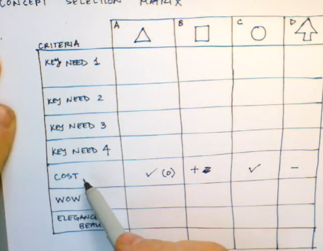
- simple scale: check, plus, minus or 1, +1, -1, 0
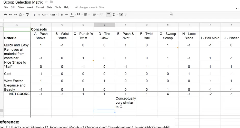
- For Ice Cream Scoop he uses a Google Doc spreadsheet
- The more left-brained have concerns about matrix selection method
- it implies that all criteria are of equal importance
- scoring matrix, adds weightings to criteria (see optional video)
- can we have more resolution, to distinguish between concepts (+ – is too simple)
- it implies that all criteria are of equal importance
- Right-brained also object
- we want to make a more holistic judgement, intuition is important
- try to make matrix consistent with intuition
- but aren’t you cooking the results? if you can make the matrix consistent with intuition then you can codify what your intuition is telling you.
- pivoting bike seat concept
- he was out riding with existing product, so when he got home he began to create a prototype with base from existing seat; attached to scooter wheel, plywood, foam rubber, rubber tubing.
- he was able to ride for several days to verify that the basic approach had merit.
- next pro type was about the right size: block of aluminum
- made ten alpha prototypes and gave to others to try. Not a production-intent design.
- Battery pack in water bottle/cage on bike
- Focused prototype: now many can you fit? you could do it mathematically but he made models out of wooden dowels. 5 will fit in a row, but not 6. This is not a comprehensive prototype. It is focused on one dimension of interest: physical shape.
- Comprehensive prototype: media shelf: built a prototype with simple materials
- Physical vs. analytical
- even for a physical artifact, the prototype need not be physical
- David Robertson designing kitchen for house. He built a cardboard kitchen. haha: focused physical prototype
- even for a physical artifact, the prototype need not be physical
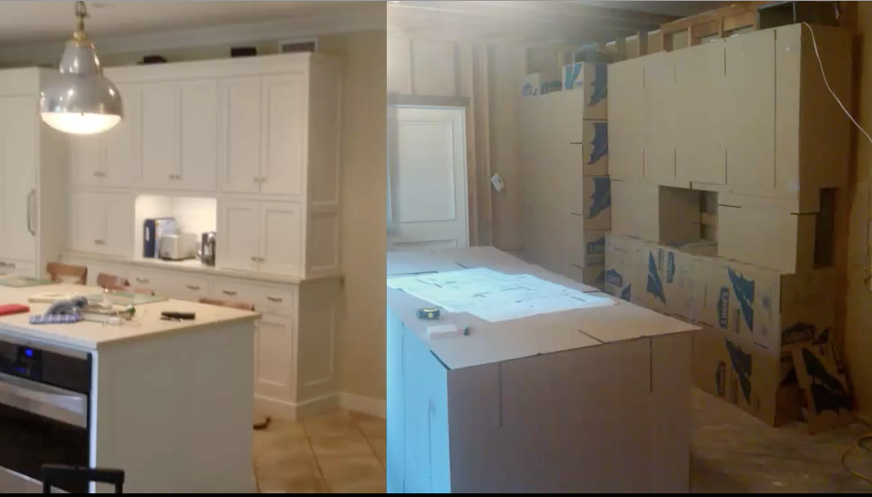
- Two man questions in design:
- Will it work? technology risk
- Will users like it? market risk
- first bike seat prototype answered question “will it work?”; second was “will they like it?”
- the ideal point model: every user has an “ideal point” at which they are maximally satisfied
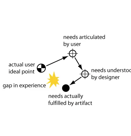
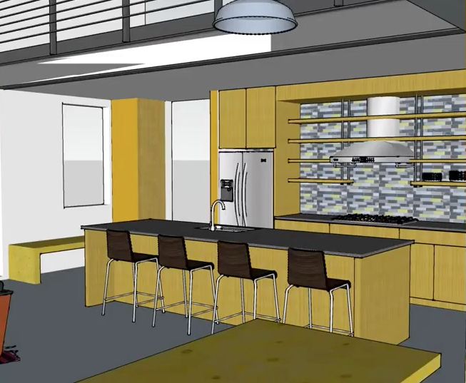
- second reasons we use prototypes is to communicate
- rustic cabin site design using Google SketchUp– goal was to communicate
- Typical labels for prototypes: PROOF OF CONCEPT, ALPHA, BETA, PRE-PRODUCTION
- beta is typically one that is made public
- all of these are comprehensive
- labels are tangible reminders of where you are in the project
- be very careful! don’t cut yourself haha
- Punch scoop: he makes as scoop from a tomato paste can and a baseball bat (took him ten minutes– haha again)
- Ball cutter/twist: uses a hacksaw and the top of the baseball bat. Files the knife edge of the scoop. Took him 30-45 minutes.
- Push and pivot. Used shortcuts– cut up an existing scoop, etc.
- Pull scoop – beveled hinge in scoop. this was the hardest because he got bevel in wrong direction. Cut bevel in wrong direction, so he had to get another scoop. This took about 2-3 hours.
- punch and twist concept. plug breaks into pieces and there is no way to release
- ball-cutter: ice cream tears and fractures in cavity
- push and press- seems to work well (I think the ice cream is getting softer)
- pull and scrape –works well, you need a wist at the end
- the *mistake* scoop– the role of serendipity in exploration — this may be one of the better options
- a graphics challenge
- detailed rules will be online
- the darwinator software for judging
Post (your website address only):
1. So that your work is self explanatory and for the benefit of the peer reviewers, please provide the one-sentence problem statement for the gap you are addressing and a list of the primary needs for your artifact. (Recall that the primary needs are the bold statements associated with each cluster of needs in your list of needs. You’ll probably have 6-12 of these.) Your problem statement can be different from what you submitted last week. Remember that it is totally normal for the problem definition to evolve. Indeed, it is even possible that the gap you are addressing may change entirely. [1 point]
2. Your selection matrix. This can be done as a spreadsheet, a table, or a hand-written document. Just make sure it is clearly readable on the screen so that your peers can easily provide you with feedback. [4 points]
3. Indicate on your matrix the concepts you will be exploring with prototypes. [1 point]
6 points total.
- Please make sure your peer reviewers know where to look for your one-sentence problem statement for the gap you are addressing (or repeat it), as well as a list of the primary needs for your artifact. (Recall that primary needs are the bold statements associated with each cluster of needs in your list of needs. You’ll probably have 6-12 of these). Your problem statement can be different from what you submitted last week. Remember that it is totally normal for the problem definition to evolve. Indeed, it is even possible that the gap you are addressing may change entirely.
- Your selection matrix. This can be done as a spreadsheet, a table or a hand-written document. Just make sure it is clearly readable on the screen so that your peers can easily provide you with feedback.
- Indicate on your matrix the concepts you will be exploring with prototypes.
Grading Rubrics:
- Student identified the one-sentence problem statement for the gap s/he is addressing and the primary needs for the artifact. [1 point]
- Student posted the selection matrix that conforms to the sample matrix provided (and that it was clearly readable on the screen). [4 points]
- Student indicated on the matrix which 2-4 concepts will be explored with prototypes. [1 point]
- Concept testing finds the gap between what they want and what we deliver.
- Will users buy/adopt/prefer the design
- Concept Test Survey
- Purchase intent survey:
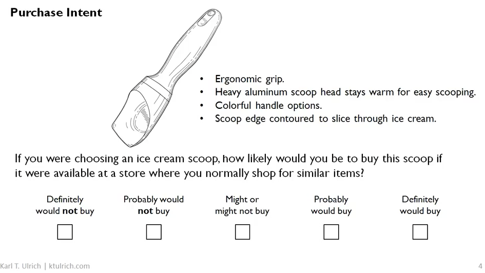
- 5-point scale is almost always used
- how accurate is the description in communicating the essence of the project?
- appeal is kinesthetic– how well can line drawing communicate it?
- photo might be better, but allowing user to try prototype is better
- the more novel the concept, the easier it is to describe with text or illustration
- asks for intention in isolation instead of considering alternatives
- how accurate is the description in communicating the essence of the project?
- Forecasting
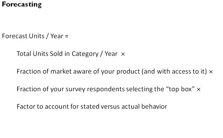
- ignore all responses but the top box “definitely would buy”
- respondents are typically over-optimistic (if 100 people say they will buy, only 25% actually will)
- Forecasts are notoriously inaccurate but are predictive of eventual sales.
- Based on feedback, geometry etc.
- “Innovation” is a new match between a solution and a need
- Design: conceiving and giving form to artifacts that solve problems
- Innovation may result from other approaches (besides designs).
- Innovation can begin with a solution and then find a need– e.g., Teflon
- Innovation Tournament
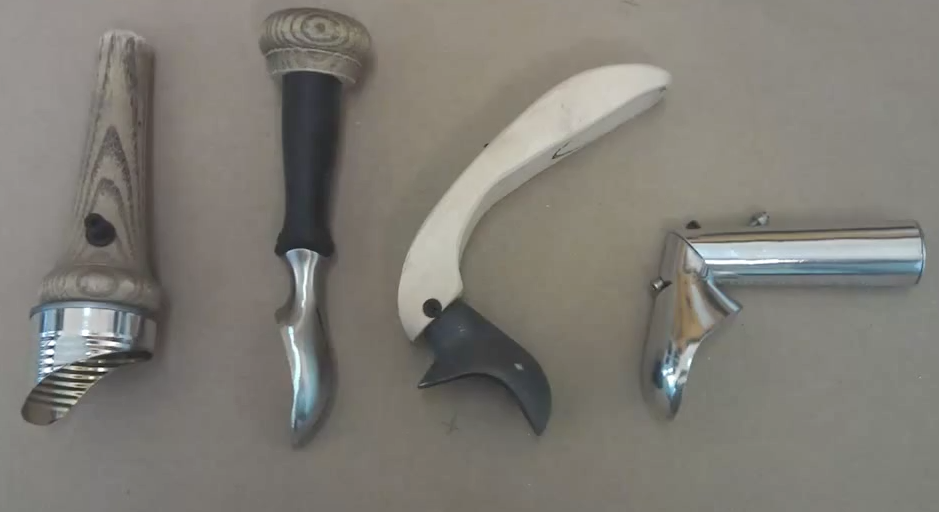
- toothbrush handle concepts
- made several dozen pencil sketches
- then balsa model shapes
- which team tried out in their hands
- then they made 5 prototypes which they tested with consumers
- toothbrush handle concepts
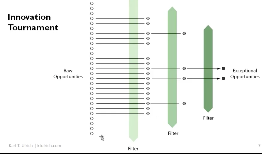
- Tournaments not limited to design
- Simvastatin example
- how do you identify the exceptional opportunity without going out of business from the cost and expense of looking at all alternatives?
- Open Tournaments – identified by public at large
- Kelly Clarkson example- American Idol
- OTher design tournaments:
- 99Designs
- Threadless
- Quirky
- X-prize
- Tesla roadster aesthetic response
- to sensory info, mostly visual
- it’s immediate
- involuntary
- to sensory info, mostly visual
- Why do aesthetics matter?
- Herman Miller Noguchi Coffee Table
- it makes him happy
- part of closing the gap, delivers value
- first impressions matter when you are trying to attract users
- these impressions are sticky and hard to change over time
- aesthetics are a signal to unobservable attributes to a product
- example of 2 convenience stores in his neighborhood
- he uses Mulberry Market and 2nd Street Wholesale– I have had the same exact experience with these actual places
- example of 2 convenience stores in his neighborhood
- Herman Miller Noguchi Coffee Table
- our brains have not changed much in 2-3 million years
- our stone age mind responds aesthetically
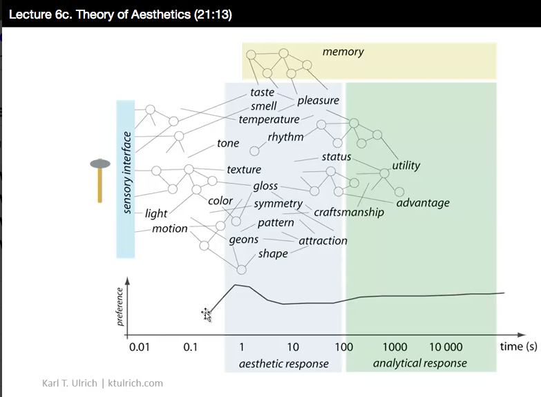
- many different cognitive mechanisms play out simultaneously
- not linear
- attraction or revulsion– computations happening over many simultaneous inputs
- not for minutes or even hours do we think of status, craftsmanship, utility
- Example of GLOSS
- iPhone 5 – Apple uses gloss effectively. As humans we are attracted to gloss, esp initially
- based on evolutionary advantages of being able to detect water
- designers stimulate response to gloss when designing objects
- experiment with glossy vs matte toys (babies prefer gloss, lick it)
- Example of CUTE
- Volkswagon new Beetle
- big round eyes, smile, rounded features– the hallmark of cute
- evolutionary adaptation for cute is clear– the young of the species are “cute”, get attention, survive. There is evolutionary pressure to like “cute”
- makes inanimate object “animate”
- Volkswagon new Beetle
- Human “physics computer”
- attraction at South Rim of Grand Canyon– Skywalk
- the floor is glass – you walk out over a cliff (!)
- most people have immediate revulsion because of the innate physics computer.
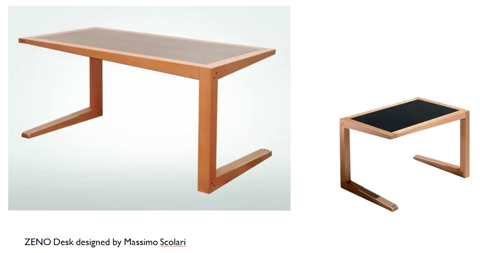
- Scolari’s Zeno desk
- attraction at South Rim of Grand Canyon– Skywalk
- iPhone 5 – Apple uses gloss effectively. As humans we are attracted to gloss, esp initially
- Teenagers are attracted to objects that annoy their parents. (His theory) -hahaha! How does this work for his ice cream scoops?
- Back to Tesla-deconstruct
- opposite of cute (really?)
- lots of animation (he sees eyes on surface, big mouth with nasty teeth, gills
- he sees a skate or a shark. Plays of a lethal sea creature
- Gloss — a trick in any auto design
- Culture– badge, etc evokes Ferrari
- “work really hard” haha
- care and notice– notice when artifacts are beautiful and your own work will become better. Train self to pay attention.
- Iterate like crazy. Lots of iteration, feedback, refinement will result in things you are happy in. (Ain’t that the truth?)
- Working in a commercial context
- if you don’t have training in design arts you will work with designers
- Balsa foam model (this stuff seems really neat)
- Louis Vuitton bag– why is the logo on the outside
- his Patagonia shirt, Apple computer
- This is a course on design, not brands or marketing, but brands are connected to artifacts
- But brands themselves are artifacts
- What brands? brands are an identifier of the source of an artifact
- the word “brand” comes from old Norse for the word “to burn”, in English goes back to a burned symbol on the hide of cattle
- in other languages the word is often connected to latin word “signum” (“design” also has its roots in this word)
- But brands do more than identify source
- brands reduce search costs for consumers (tomato paste example)
- brands are themselves attributes of artifacts and carry meaning that is often useful or valuable to users
- one value is prestige – if you buy Louis Vuitton bag, you can signal that you are wealthy
- other values too. Example of his friend at top of mountain with Patagonia fleece. It signals outdoorsy values (not much different from LV on handbag)
- Example of bug assault –uses salt as ammunition. “Bug Assault” -name evokes what it does
- counterexample “Chock Full O Nuts” coffee. People think there are nuts inside hahah!
- Associations evoked are positive.
- example of sleep medication “Lunesta”
- name should be easy to say, easy to remember “Blackberry”, HP (better than KPMG)
- unambiguously spell-able (so people can google it!)
- domain name (unique), not coca-cola, register obvious spelling
- Just an artifact, or also an organization?
- do you need a domain name or just a product name?
- what attributes are you trying to evoke?
- Plus some or all of standard needs:
- evokes the thing you are naming
- positive associations
- easy to say
- memorable
- unambiguous spelling
- legally and practically available
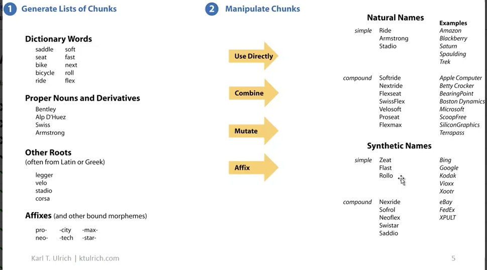
- Use decomposition for exploration
- dictionary words saddle, bike, etc
- proper nouns and derivatives Bentley, Swiss
- other roots (often from latin or greek) corsa, vela
- affixes (suffixes, prefixes, etc.) “pro” or “neo”
- example of driving pickup truck, wants to limit environmental damage of driving
- wind power, philadelphia electric, figured out fossil fuel equivalent between gallon of gas and kilowatt hours of electricity
- started buying wind power from utility co to offset gas burned,
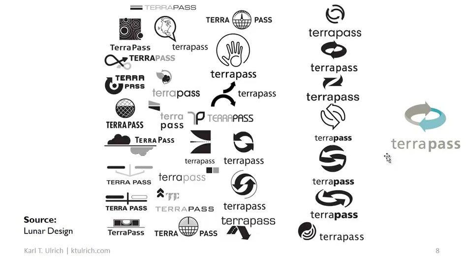
- terrapass, environmental offsets– sells the lack of something, a pure, intangible service
- in what way does design play a role in this service?
- Pure Physical Goods vs. Pure Service
- most are a combination (example: KFC)
Karen Rile
Creative Writing Faculty
University of PennsylvaniaEditor, Cleaver Magazine