Assignment #6.1
X: Alpha Prototype
My design gap: a way to incorporate occasional reviews of small-press poetry and fiction publications in my quarterly literary magazine.
Explanation of my prototype: The main content on the magazine website consists of poems, short stories, essays, and artwork, organized into separate articles. Issues are published quarterly (every 3 months.) Recently we rolled out a new feature, book reviews, that will be published frequently (a few per week), in between issues. My gap is to think of a way to design the book review pages so that they maintain the branding of our website but are also instantly distinguishable from the literary content.
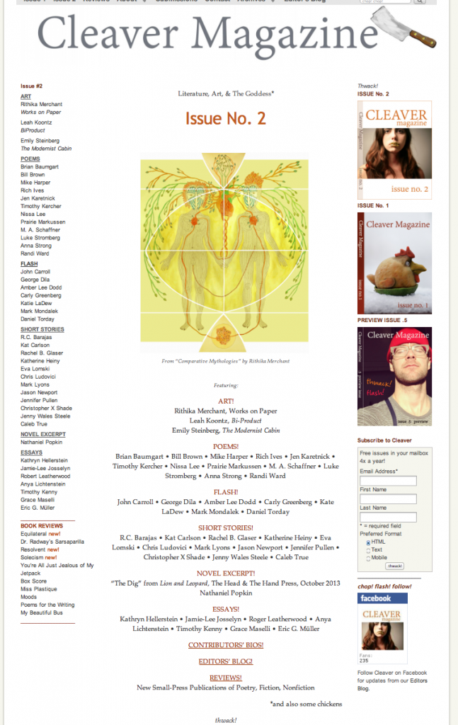
For context, here is a screenshot of the magazine splash page (click for large version):
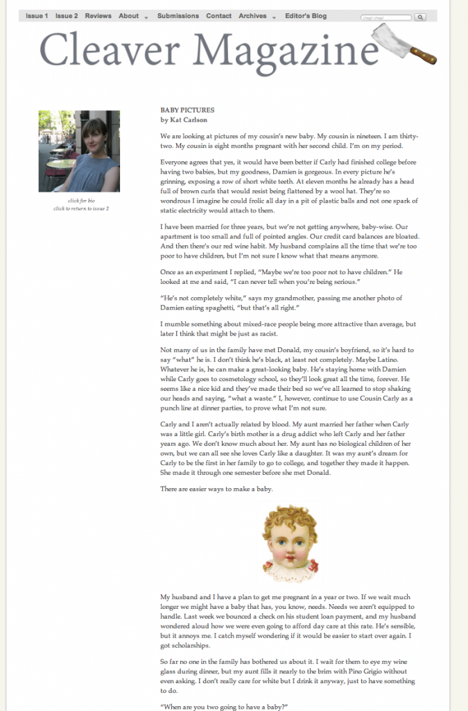
And here is a screenshot of a typical literary page, a short story from Issue 2 (click for larger):
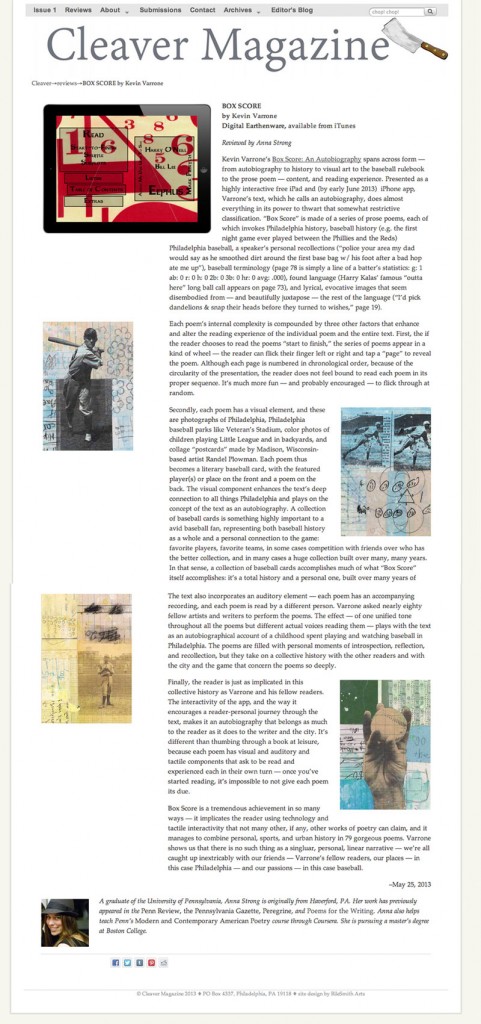
After last week’s product testing, my testers picked this design:

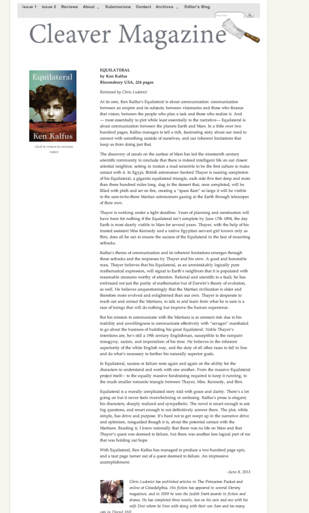
MY ALPHA PROTOTYPE:
During the week I made a number of refinements which are viewable live at the site.* Please go here: http://www.cleavermagazine.com/equilateral-by-ken-kalfus/ to see it in action. (For reference, I am pasting a screenshot below.)
*For anyone interested, these refinements include removing the category “breadcrumbs” and adding “click to return to reviews index” beneath the book icon, for navigational purposes. I also moved the reviewer’s bio/photo inline with the rest of the text– it just looked better that way.


