Click on any of the thumbnails for a full-size image!
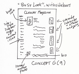
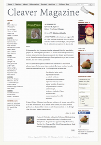
Concept and Prototype A: “Busy” look with full site-wide sidebars. Book icon is in upper left and author’s photo/bio are at bottom.
————–
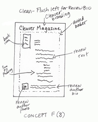
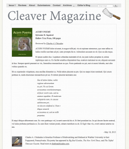
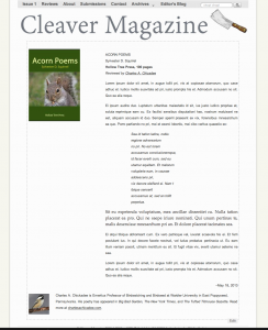
Concept and Prototype B: Full width text (to distinguish from literary site content, which is presented with 300 px padding). Book icon at top; reviewer bio and photo at bottom. Dotted border.
————–
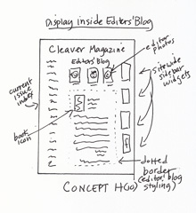
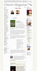
Concept and Prototype C: Displaying reviews inline with the existing Editors’ Blog.
————–
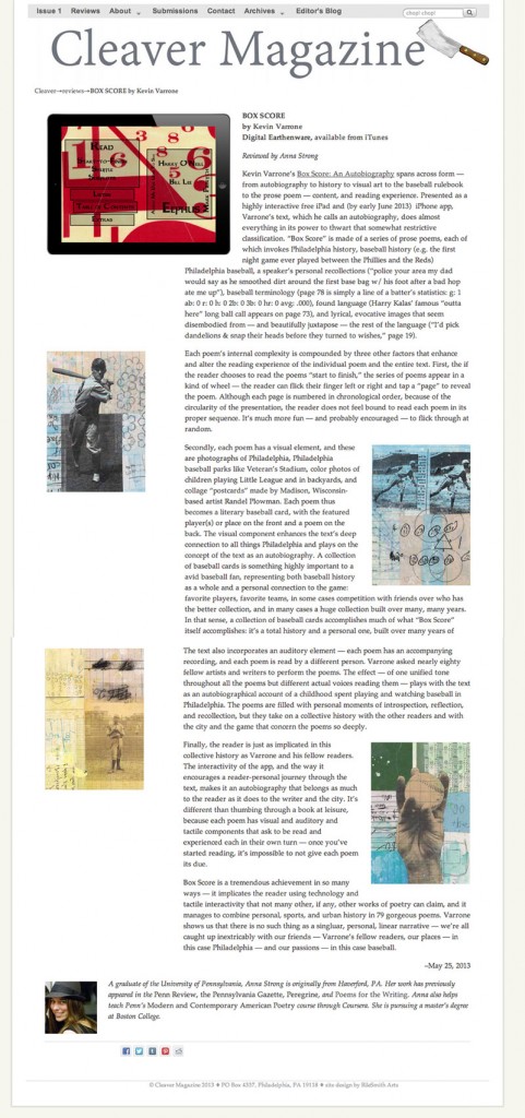
Concept D: The text of the review has 300 px padding to the right. To the right is an example that is also live on the site.
D I am assuming that this is for an on-line publication (that’s how I see Cleaver. Sidebars are very annoying to read on a scrolling screen. I don’t really like multiple columns because I have to scroll up again to continue. I also do not like print that is very wide (like the bottom of D though I do not mind the photos in the columns. I read a line at a time and do not like any printing so wide that I have to do it in more than one scan per line.
D (on my computer.) But I wonder if that would work as well on my phone. . .