X: PROTOTYPING
My design gap: a way to incorporate occasional reviews of small-press poetry and fiction publications in my quarterly literary magazine.
List of 6-12 Primary User Needs:
- The review content will be easy to identify from the front page of the magazine.
- The review content will be easy to access from the front page and other menu pages of the magazine.
- The review content is accessible through an index tab on the magazine.
- The reviews are attractive and easy to read.
- The review authors are identified by easy-to-locate bios/photos.
- The review authors are easy to locate through an index.
- The review authors are clearly identified as separate from the literary authors on the site.)
- The review content has a different look/feel to easily distinguish it from the literary content on the site, while retaining the basic brand of the site. (!)
- The review content is easy to navigate to and from, in any part of the magazine.
- The reviews are fun or have some kind of whimsical element, incorporating graphics and/or text (!)
Concept Sketches and Prototypes:
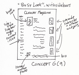
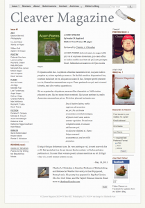
Concept and Prototype G (9): “Busy” look with full site-wide sidebars. Book icon is in upper left and author’s photo/bio are at bottom.
————–
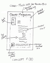
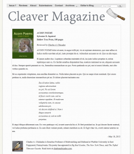
Concept and Prototype F (8): Full width text (to distinguish from literary site content, which is presented with 300 px padding). Book icon at top; reviewer bio and photo at bottom. Dotted border.
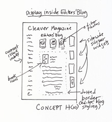
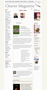
Concept and Prototype G (10): Displaying reviews inline with the existing Editors’ Blog.
