My design gap: a way to incorporate occasional reviews of small-press poetry and fiction publications in my quarterly literary magazine.
List of 6-12 Primary User Needs:
- The review content will be easy to identify from the front page of the magazine.
- The review content will be easy to access from the front page and other menu pages of the magazine.
- The review content is accessible through an index tab on the magazine.
- The reviews are attractive and easy to read.
- The review authors are identified by easy-to-locate bios/photos.
- The review authors are easy to locate through an index.
- The review authors are clearly identified as separate from the literary authors on the site.)
- The review content has a different look/feel to easily distinguish it from the literary content on the site, while retaining the basic brand of the site. (!)
- The review content is easy to navigate to and from, in any part of the magazine.
- The reviews are fun or have some kind of whimsical element, incorporating graphics and/or text (!)
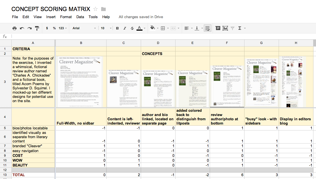
Selection Matrix:
(click on image for larger size)
I loved using this tool. The result, that Concept F is the best design, confirms my intuitive assumption after working through the visual designs last week. I was a little surprised at how pronounced the results were– I thought they would be closer. At first glance it appears that, for my prototypes, I should focus on the F, G, and H. However, G and H are significantly more costly, in terms of labor. So perhaps I should add C to the mix.
