EXPLORATION (10 CONCEPTS)
My design gap: a way to incorporate occasional reviews of small-press poetry and fiction publications in my quarterly literary magazine.
Primary User Needs:
- The review content will be easy to identify from the front page of the magazine.
- The review content will be easy to access from the front page and other menu pages of the magazine.
- The review content is accessible through an index tab on the magazine.
- The reviews are attractive and easy to read.
- The review authors are identified by easy-to-locate bios/photos.
- The review authors are easy to locate through an index.
- The review authors are clearly identified as separate from the literary authors on the site.)
- The review content has a different look/feel to easily distinguish it from the literary content on the site, while retaining the basic brand of the site.
- The review content is easy to navigate to and from, in any part of the magazine.
DECOMPOSITION
For this exercise I chose two user needs and approached each as a sub-problem, coming up with a list of potential solutions. Click on the links for a visual demonstration.
A. The review content has a different look/feel from the literary content on the site, while retaining the basic brand of the site.
- colored background (contrast with white background in literary posts.)
- different font (contrast with serif font in literary posts)
- borders (contrast with no border on literary fonts. See styling in Editors’ Blog.)
- padding/no padding (contrast 300 pixel padding style in literary posts with full-width style in Editors’ Blog.)
- use a different site or custom css as a workaround for suppressed post headings (due to overall site rules) Explanation: to preserve the “magazine look” I have suppressed the usual post meta-data. But the blog-like entries look better with meta-data. So I manually re-created this, in the Editor’s Blog.)
- make reviews part of Editor’s blog? Instead of their own category?
- use sidebars/no sidebars? (Sidebars=busy appearance, easier to navigate site; no sidebars=easier to focus on text)
- featured images (book covers?)
- featured images (book authors vs. review authors)
B. The review authors are identified by easy-to-locate bios/photos.
- separate bio/photo page for all reviewers (example)
- bio/photo at the bottom of the page
- author photo as featured image, bio at bottom
- author photo as feature image, link to bio on separate bio page
- author photo as featured image, link to personal site of reviewer
- bio/photo on separate review contents page
- no reviewer’s photo, bio at bottom
- no reviewer’s photo or bio, link to outside personal page only
10 DESIGN CONCEPTS
Note: for the purposes of the exercise, I invented a whimsical, fictional review author named “Charles A. Chickadee” and a fictional book, titled Acorn Poems by Sylvester D. Squirrel. I mocked-up ten different designs for potential use on the site.
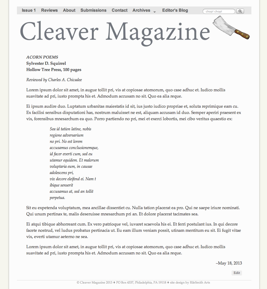
Concept #1: Full-width (no sidebars), no reviewer photo or bio, no featured image. This is the plainest, simplest cleanest look. (Click thumbnail for full-size image.)
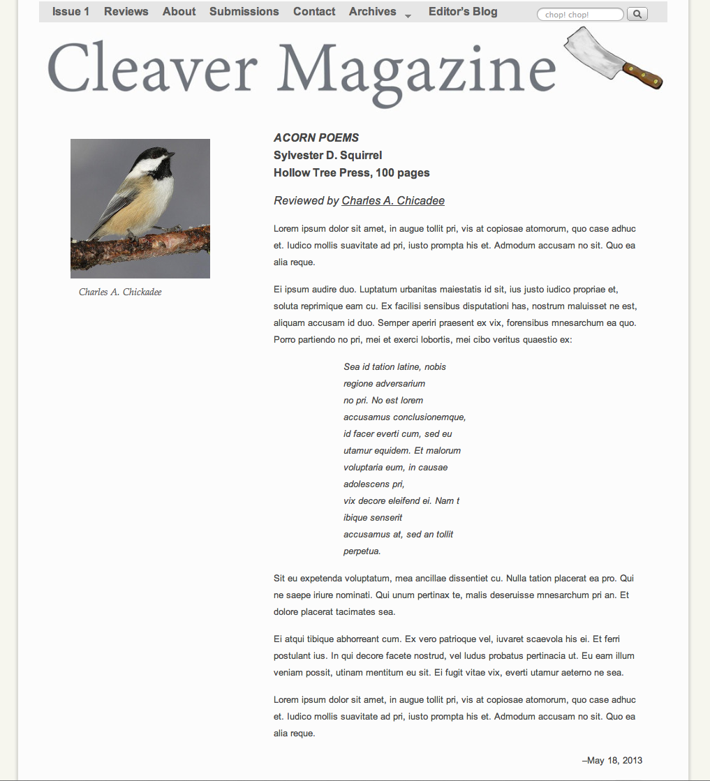
Concept #2: 300 px padding for review content; review author’s photo aligned left. Link to bio of reviewer; no image or artwork of the book. This is also a clean look and is aligned with the design of the original literary posts on the site. I think it looks too similar to the literary posts and is difficult to differentiate at a glance. (Click thumbnail for full-size image.)
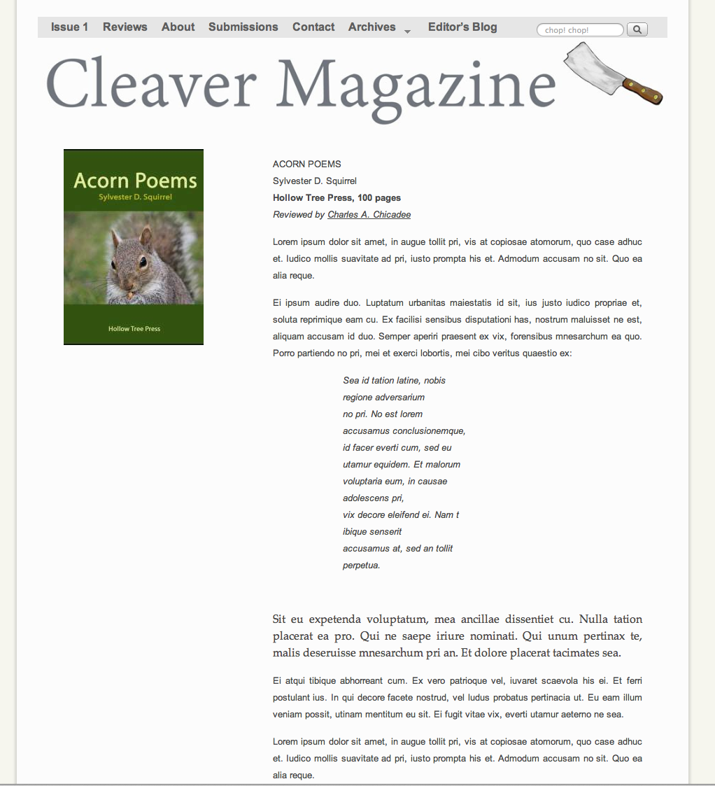
Concept #3: 300 px padding for review content; link to author photo and bio on a different page (example); artwork for book cover is aligned left. This look separates the literary post style from the review post style, but I think that different alignments are visually awkward, as is the shape of the book art cover (author’s photos on the site are cropped square. (Click thumbnail for full-size image.)
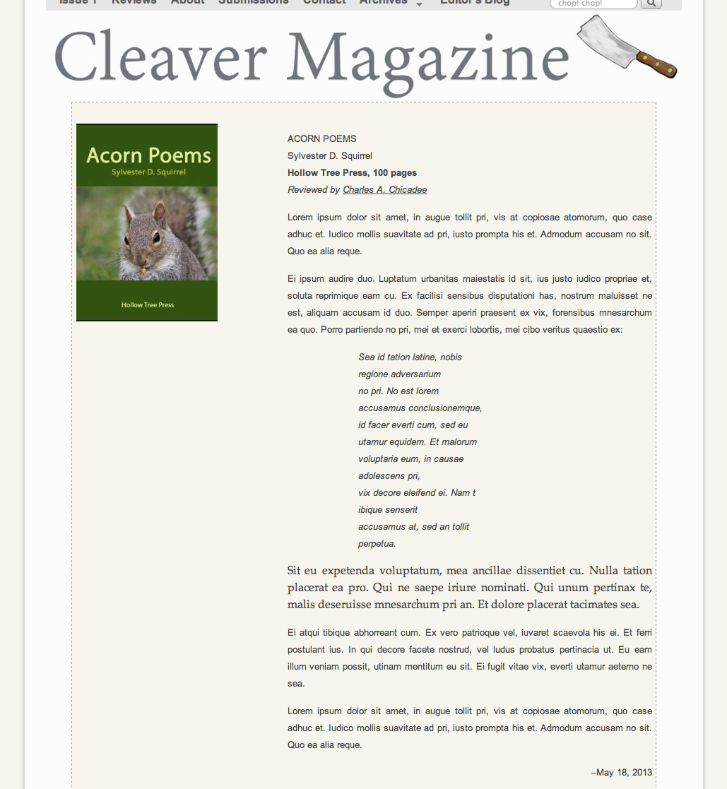
Concept #4: 300 px padding for review content, etc., as in #3. Added colored background and dotted border, to distinguish from literary post contents. I think it’s ugly. (Click thumbnail for full-size image.)
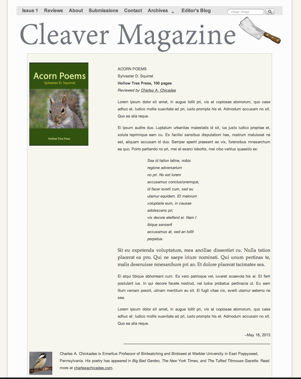
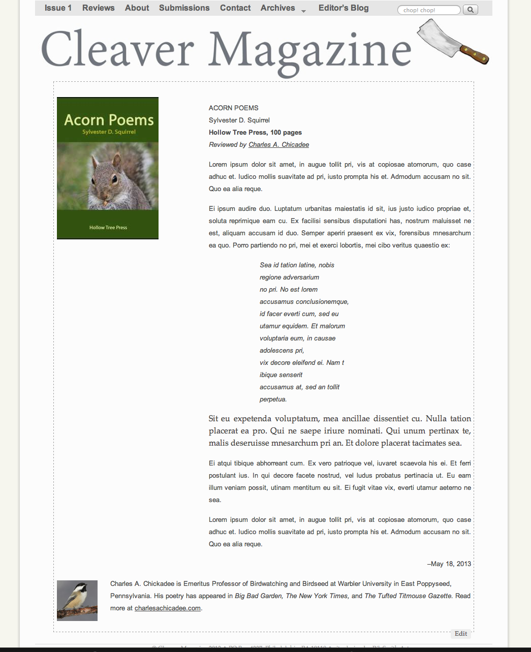
Concept #5: 300 px padding for content, colored background and dotted border, added author’s photo and bio at bottom, instead of in separate link. (Click thumbnail for full-size image.)
Concept #6: Same as above, but no color in the background. (Click thumbnail for full-size image.)
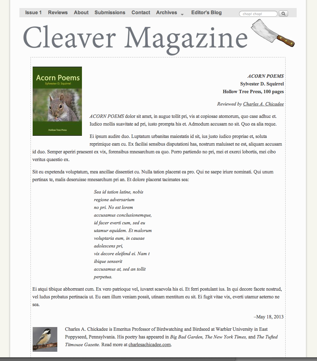
Concept #7: Full-width, Book info is flush right. (Click thumbnail for full-size image.)
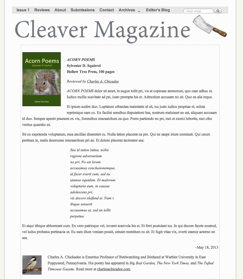
Concept #8: Same as above, info flush left. (Click thumbnail for full-size image.)
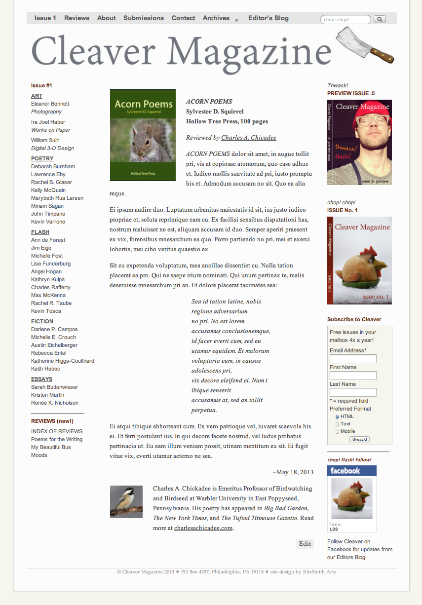
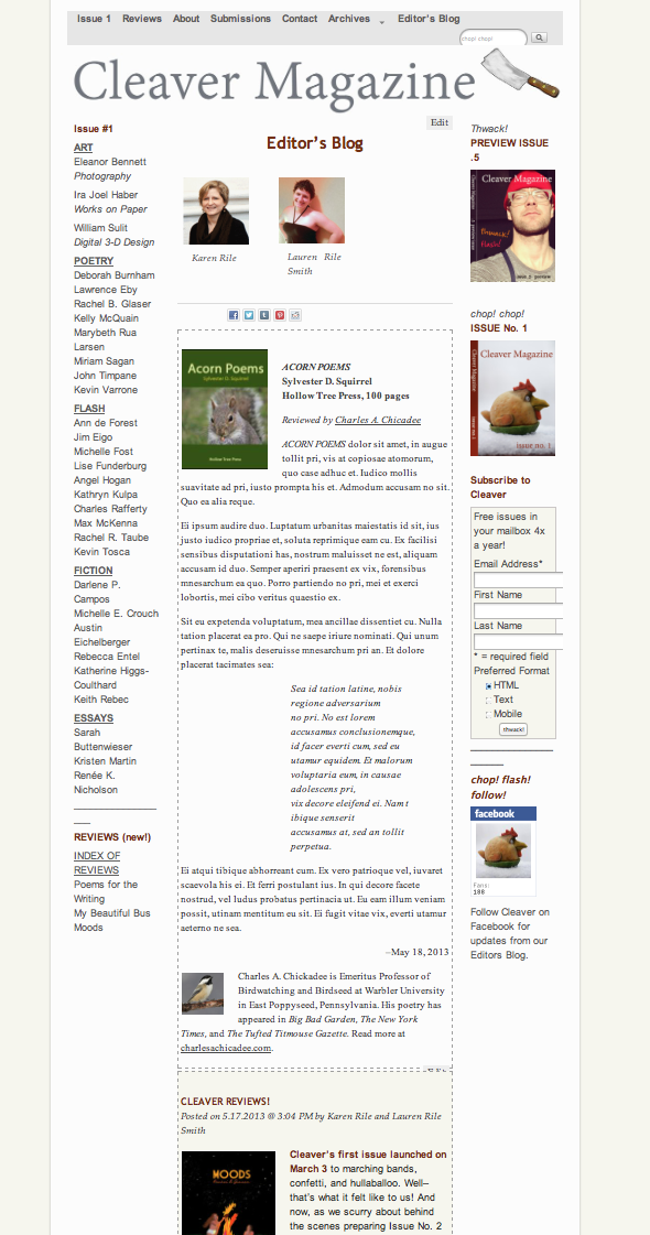
Concept #9: With sidebars (for a “busier” look) and easy access to other menus. (Click thumbnail for full-size image.) (Click thumbnail for full-size image.)
Concept #10: Display as part of Editors’ Blog:
